Buttons

Buttons are a powerful tool that will help your users interact with the text, images, plots and simulations within your document. We're going to discuss using buttons to change simple text attributes (colour, visibility, etc), however you will most likely be using buttons to control more complicated events. In those cases, we suggest looking at the Scripting Reference post, as well as the topic-specific blog posts located in the Guides (Simulations, Plots, etc).

Example 1

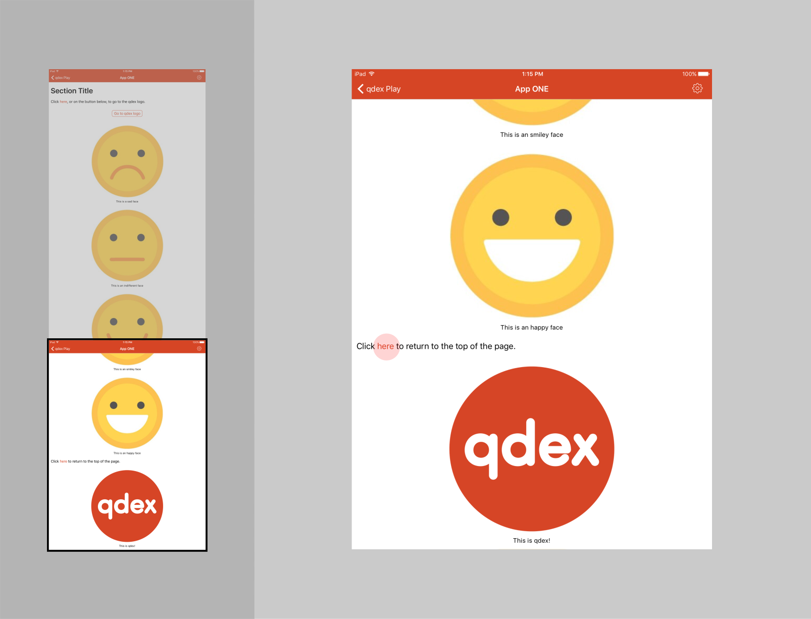
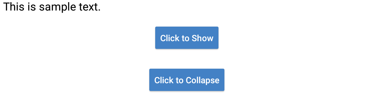
This example uses two buttons to show/hide text. The text in paragraphOne is initially collapsed (i.e. completely hidden from the user and taking up no space in the page), and the first button is used to make it visible. The second button is used to collapse the text again. Ensure that the scripting keywords Style and Visibility are capitalised. 

You can copy this example into your document as-is.

<p name="paragraphOne" style="collapsed">
  This is sample text.
</p>

<button content="Click to Show">
    <onClick>
    paragraphOne.Style.Visibility = "visible";
  </onClick>
</button>

<button content="Click to Collapse">
  <onClick>
    paragraphOne.Style.Visibility = "collapsed";
  </onClick>
</button>


Example 2

This example uses one button to toggle text. The button initially reads "Click Me". When it is pressed the if statement in the onClick event changes the text on the button to "Click Me Again". Tapping the button again triggers the else statement, which resets the button to "Click Me".

You can copy this example into your document as-is.

<button name="toggleButton" content="Click Me">
  <onClick>
    if toggleButton.Text == "Click Me" then
    toggleButton.Text = "Click Me Again";
    else
    toggleButton.Text = "Click Me";
    end
  </onClick>
</button>


Example 3

This example demonstrates how to use styles to make it easier to see when an attribute has been toggled. A style is used initially to make the button blue with white text. Each time the button is pressed, the background color is toggled between blue and black using an if statement. 

You can copy this example into your document as-is.

<style name="button_style">
  <foreground color="white" />
  <background color="cornflowerBlue" />
</style>

<button name="aButton" content="On" style="button_style">
  <onClick>
    if aButton.Text == "On" then
    aButton.Style.BackgroundColor = color.rgb(10,10,10);
    aButton.Text = "Off"
    else
    aButton.Style.BackgroundColor = color.cornflowerBlue;
    aButton.Text = "On"
    end
  </onClick>
</button>
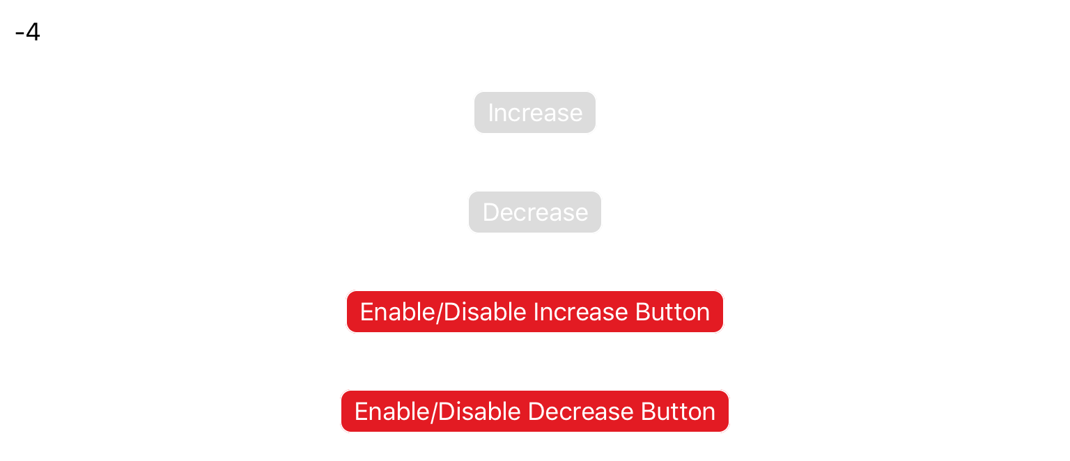


Example 4

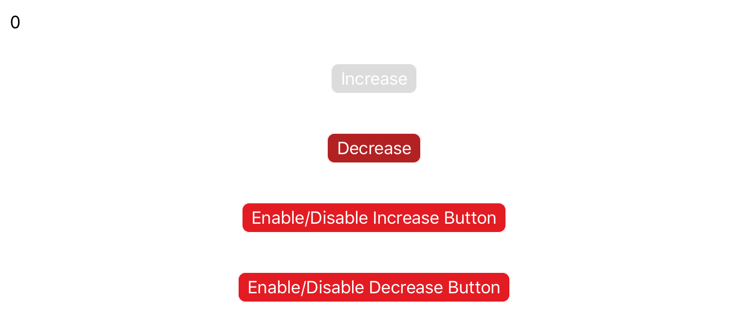
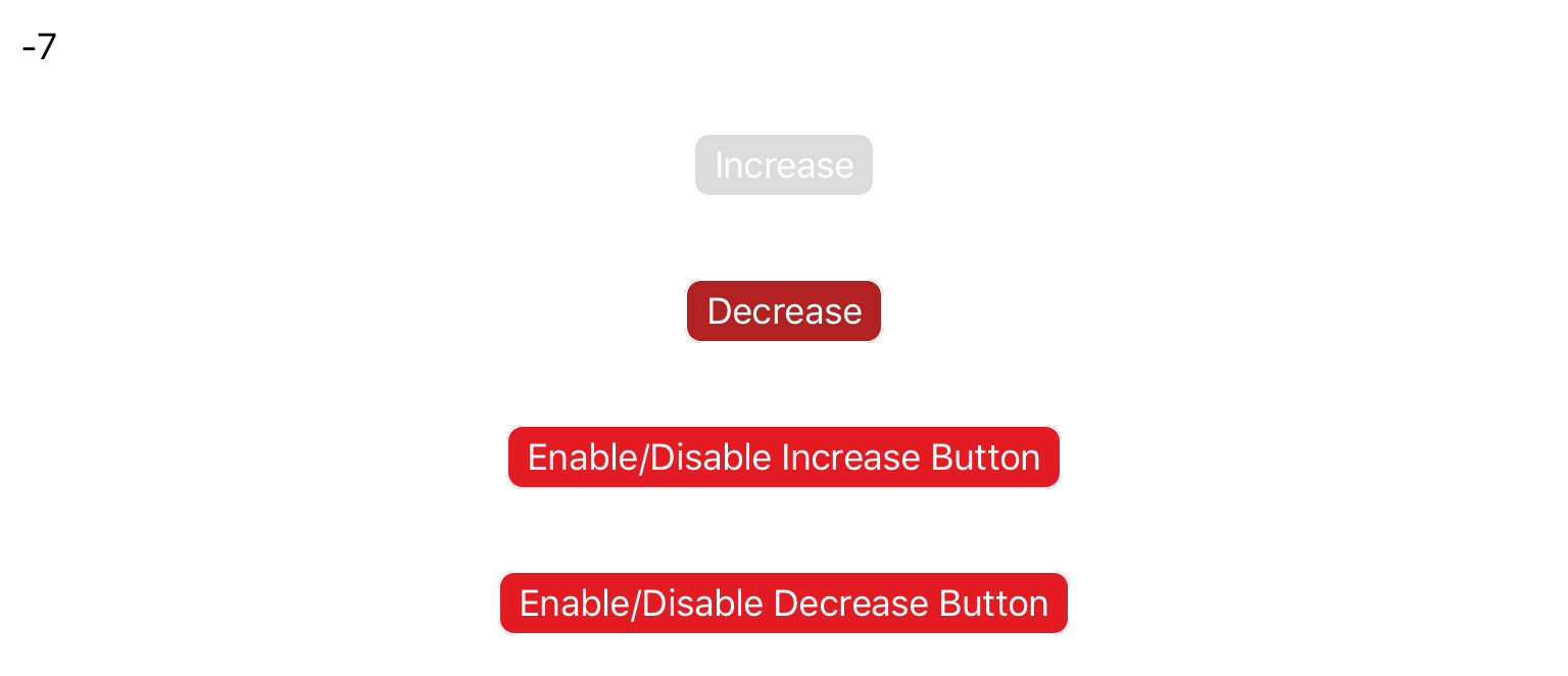
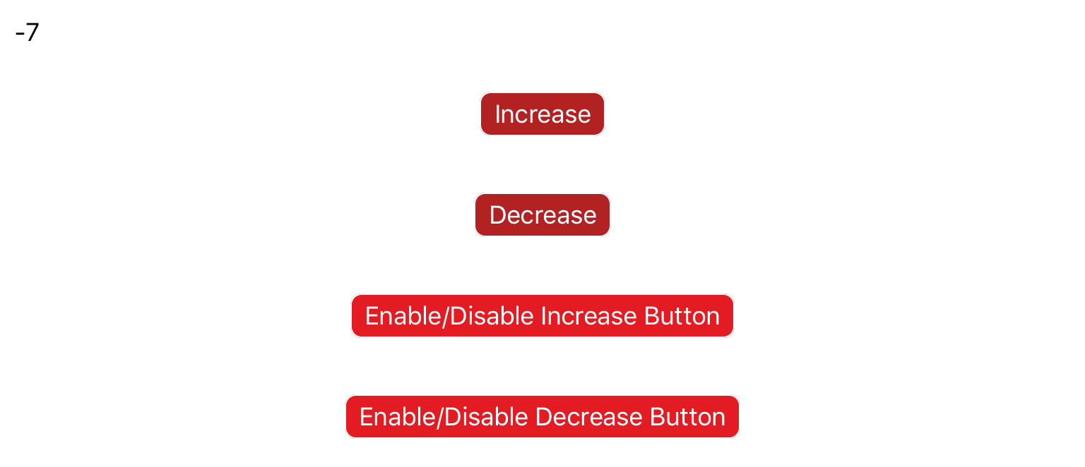
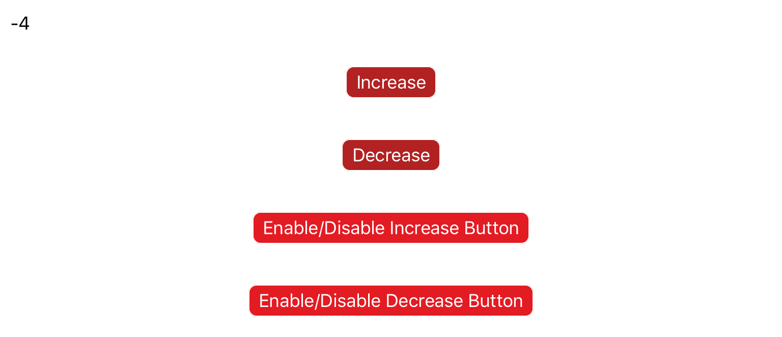
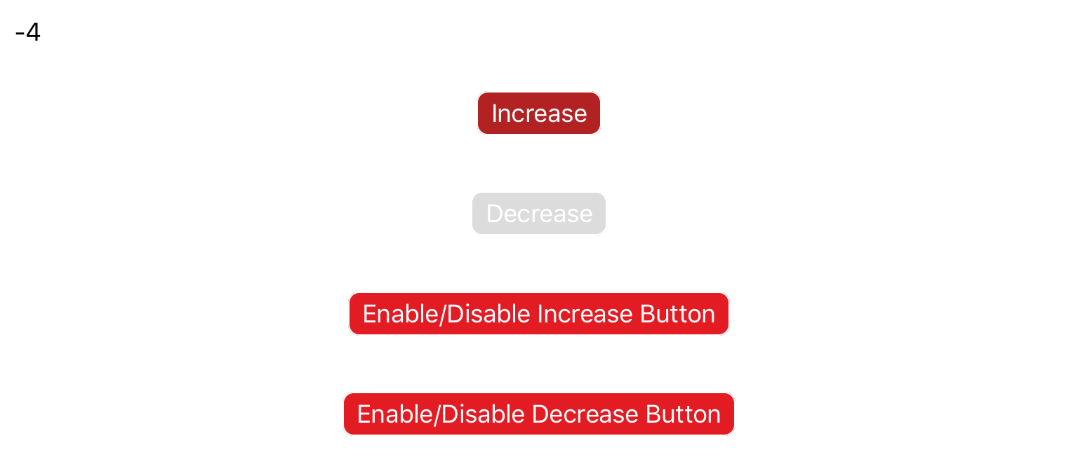
This example demonstrates how to use the below script to enable/disable buttons. Disabling a button stops the onClick event scripts from executing. 

<script>
    enabled = {}

    function disable(buttonName)
    enabled[buttonName] = false
    buttonName.Style.BackgroundColor = color.gainsboro
    end

    function enable(buttonName)
    enabled[buttonName] = true
    buttonName.Style.BackgroundColor = color.fireBrick
    end
</script>

Two buttons are used to increase or decrease a value that is output to a paragraph. Two other buttons show how you can use the above functions to disable the buttons.

<script>
    -- Initialize the button states
    disable(incButton)
    enable(decButton)

    -- Initialize the number value
    num = 0
</script>

<p name="outputLabel">0</p>

<!-- Button to increase value. Note that script is contained inside an if-statement. -->
<button name="incButton" content="Increase">
    <onClick>
        if enabled[incButton] then
          num = num + 1
          outputLabel.Text = string.format("%d", num)
        end
    </onClick>
</button>

<!-- Button to decrease value. Note that script is contained inside an if-statement. -->
<button name="decButton" content="Decrease">
    <onClick>
        if enabled[decButton] then
          num = num - 1
          outputLabel.Text = string.format("%d", num)
        end
    </onClick>
</button>


<!-- Buttons to enable/disable the increment buttons -->
<button content="Enable/Disable Increase Button">
    <onClick>
        if enabled[incButton] then
        disable(incButton)
        else
        enable(incButton)
        end
    </onClick>
</button>

<button content="Enable/Disable Decrease Button">
    <onClick>
        if enabled[decButton] then
        disable(decButton)
        else
        enable(decButton)
        end
    </onClick>
</button>


Advanced

To learn more about the types of attributes that can be toggled with a button, see the Scripting Reference post in the Knowledge Base. 

Toggle

A toggle is a type of button that can be used for binary options (true/false, on/off, etc). At this time they do not automatically include text, so you will have to make it clear what option is being toggled using labels or paragraphs. Take a look at the Scripting Reference post for information on using the toggle button to interact with other elements in your app. 

Example 1

This example uses a toggle to turn a simulation on and off.

You can copy this example into your document as-is.

<sectionNoTitle name="sectionName">

  <p>Simulation</p>
  
  <toggle name="myToggle">
    <onValueChanged>
      if myToggle.Value then  -- If the value of my toggle is 'true'
      sim:Start()
      else                    -- If the value of my toggle is 'false'
      sim:Stop()
     end
    </onValueChanged>
  </toggle>

  <timePlot name="simPlot" />

  <simulation duration="10" name="sim" period="0.01">
    <solver>
      <series>
        <sine />
        <probe ref="sectionName.simPlot" />
      </series>
    </solver>
  </simulation>
</sectionNoTitle>  

Example 2

You can use a table with the grid lines turned off to make it clear what the toggle options are.

You can copy this example into your document as-is.

<section name="sectionName">
  <title>Simulation</title>

  <table name="toggleTable" grid="false" widths="40% 20% 40%">
    <row>
      <column>
        <p style="rightText">Off</p>
      </column>
      <column>
        <toggle name="thisToggle" style="center" onValueChanged="if thisToggle.Value then sim:Start() else sim:Stop() end" />
      </column>
      <column>
        <p>On</p>
      </column>
    </row>
  </table>

  <timePlot name="simPlot" />

  <simulation duration="10" name="sim" period="0.01">
    <solver>
      <series>
        <sine />
        <probe ref="sectionName.simPlot" />
      </series>
    </solver>
  </simulation>
</section>
 
Simulation-Toggle-Off.png
Simulation-Toggle-On.png
 

Sliders

Sliders are another tool that allow users to manipulate elements in your documents. Like buttons, they can be used to control attributes in some of the more complicated features like simulations.

Example 1

This example includes a slider, button and a paragraph. The slider updates the paragraph text with the current value of the slider. Note that value is an inherent variable inside of the onValueChanged event, and represents the current number value of the slider. The button can then be used used to set the slider to its original value (2). When the button resets the slider, the onValueChanged event is also triggered. 

You can copy this example into your document as-is.

<slider name="mySlider" min="0" max="5" value="2">
  <onValueChanged>
    myParagraph.Text = string.format("Value of slider: %0.1f", value);
  </onValueChanged>
</slider>

<button content="Reset Slider" onClick="mySlider.Value = 2"/>
    
<p name="myParagraph">
  Value of slider: 2
</p>


Advanced

For more information on attributes that can be altered using sliders, take a look at the Scripting Reference post. 

This is a helpful guide for more information on formatting strings in Lua.

Text Fields and Inputs

textField and textInput boxes allow users to input text characters into your app. The textField box only accommodates a single line of text, whereas the textInput box allows for multiline input. 

Example 1

This is a simple fill in the blank example. The user types input into the textField, then uses the button to add the text to the paragraph. The CDATA tags inside of the button are used so that the parser does not register the angle brackets of the underline (<u>) tag as XML code, and instead treats the code as Lua script. 

You can copy this example into your document as-is.

<p name="aParagraph">
  Fill in the blank: This example is super _______!
</p>
    
<textField name="myInput">
  <placeholder>
    Type here
  </placeholder>
</textField>

<button content="Fill in the Blank">
  <onClick> <![CDATA[
    aParagraph.FormattedText = string.format("Fill in the blank: This example is super <u>%s</u>!", myInput.Text);
    ]]>  
  </onClick>
</button>

Spelling

You can specify if spellchecking is performed in your textField or textInput, enabling users to enter data without it being autocorrected. To disable, simply set the spelling attribute to false. 

<textInput spelling="false">
  <placeholder>Insert answer here</placeholder>
</textInput>

Choice List

Choice lists are radio buttons that allow users to select between a group of mutually exclusive options. They can be used for multiple choice type questions, or to select parameters for simulations. 

Example 1

This example uses a choice list to allow users to select between three numbered options (1, 2, or 3).

You can copy this example into your document as-is.

<choiceList name="numChoice">
  <choice content="1" />
  <choice content="2" />
  <choice content="3" />
</choiceList>


Example 2

This example includes a choice list of colours that when tapped output the current selection value to a label. The onDocumentOpened event is used to set the color of alternating rows. The style is used to adjust the width of the list. 

You can copy this example into your document as-is.

<choiceList name="myChoices" value="2">
  <style>
    <widthPercentage>0.8</widthPercentage>
    <horizontalAlignment>center</horizontalAlignment>
  </style>
  <onDocumentOpened>
    for i = 1, myChoices.Children.Count,2 do
    myChoices:Child(i).Style.BackgroundColor = "gainsboro"
    end
  </onDocumentOpened>
  <onValueChanged>
    selection.Text = 'Selected value: ' .. tostring(value);
  </onValueChanged>
  <choice content="Red" />
  <choice content="Blue" />
  <choice content="Green" />
  <choice content="Purple" />
  <choice content="Yellow" />
  <choice content="Orange" />
</choiceList>

<label name="selection">Selected value: </label>


Cross References

Cross references are links that can be used to navigate around a single app, or between multiple apps that you have authored. They can be tapped on from a paragraph like a web link, or defined inside of an app control element (e.g. button, slider, etc).

Example 1: Links on the Same Page

This example shows two ways to create a cross reference to an element on the same page. The first cross reference is in a paragraph, and the second cross reference is in a button. There is a third paragraph-style cross reference at the end, to return the user to the top of the app.

You can not copy this example into your document as-is without including images in your resource folder with the same names as the images below (e.g. figure1, figure2, etc).

<!-- Cross Reference in text -->
<p>
   Click <crossRef ref="mySection.figure5">here</crossRef>, or on the button below, to go to the qdex logo.
</p>

<!-- Cross Reference in a button -->
<button content="Go to qdex logo">
  <onClick>
    application.navigateTo(figure5)
  </onClick>
</button>

<figure name="figure1">
  <image src="resources/1.jpg" style="medium" />
  <title>This is a sad face</title>
</figure>
<figure name="figure2">
  <image src="resources/2.jpg" style="medium" />
  <title>This is an indifferent face</title>
</figure>
<figure name="figure3">
  <image src="resources/3.jpg" style="medium" />
  <title>This is an smiley face</title>
</figure>
<figure name="figure4">
  <image src="resources/4.jpg" style="medium" />
  <title>This is an happy face</title>
</figure>

<!-- Cross Reference in text -->
<p>
  Click <crossRef ref="myDocument.Section1">here</crossRef> to return to the top of the page.
</p>

<figure name="figure5">
  <image src="resources/qdex.png" style="medium" />
  <title>This is qdex!</title>
</figure>


Example 2: Links Across Pages

In this example the destination of the link is on a different page of the same app. Two paragraph links on Page 1 are used to send users to the second and third pages. The second page contains a paragraph cross reference link to the first page. The third page contains a button cross reference to the first page.

Note that in the example below, myDocument refers to the name of the document. This can be found at the top of the document in Visual Studio.

You can copy this example into your document as a top-level section (i.e. not inside any sections).

<!-- Page 1 -->
<section name="tableOfContents">
  <title>Table of Contents</title>
  <p>
    <crossRef ref="myDocument.section1">Section 1</crossRef>
  </p>
  <p>
    <crossRef ref="myDocument.section2">Section 2</crossRef>
  </p>
</section>

<!-- Page 2 --> 
<section name="section1">
  <title>Section 1</title>
  <p>
     Click this <crossRef ref="myDocument.tableOfContents">cross reference</crossRef> to go back to the Table of Contents.
  </p>
</section>

<!-- Page 3 --> 
<section name="section2">
  <title>Section 2</title>    
  <button content="Go to Table of Contents">
    <onClick>
      application.navigateTo(tableOfContents);
    </onClick>
  </button>        
</section>


Example 3: Links Across Apps

This example illustrates how to use the document ID of a Learning Module to link to another module in the qdex Play app. Note that the user must be logged into an account that has access to the destination module.

The following is an example of two apps, and how you can use the document ID to link between them. You can not copy this example into your document as-is.

Document A

<document xmlns="http://resources.qdexapps.com/schema/v1/QDocument.xsd" name="myDocument" id="GBDC191BF_9982_4CE0_8FFC_C3ACCF1986DE">
  ...
  <section>
    <title>This is a Page in App ONE</title>
    <p>
      Click this <link url="qdex:/G5A145101_80B3_4A18_81F1_0C90B3A170C9">link</link> to open App 2.
    </p>
  </section>
</document>


Document B

<document xmlns="http://resources.qdexapps.com/schema/v1/QDocument.xsd" name="myDocument" id="G5A145101_80B3_4A18_81F1_0C90B3A170C9">
  ...   
  <section>
    <title>This is a Page in App <b>TWO</b></title>
    <button content="Return to App 1">
      <onClick>
       application.navigateTo("qdex:/GBDC191BF_9982_4CE0_8FFC_C3ACCF1986DE#mySection")
      </onClick>
    </button>
  </section>
</document>