

Controls
qdex assets are a collection of templates, interactions, objects, and controls that users can implement in their modules. Users are encouraged to copy and modify the code as they see fit.
Controls are qdex elements that allow users to specify values or interact with other qdex components.
Drop Down Options


This object uses buttons to simulate a drop down menu that allows users to choose an option from a preset selection.
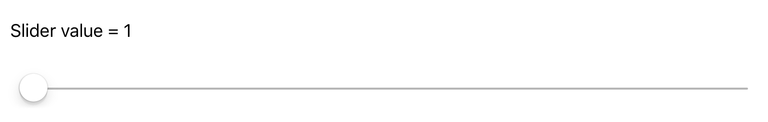
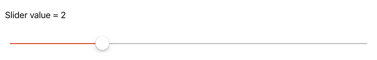
Slider with Label


This control includes a slider with a label that outputs the current value of the slider.
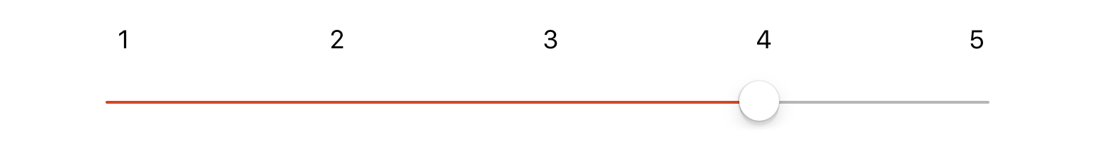
Slider with Number Range


This control includes a slider with labels to represent the approximate number that the slider has selected.
Locking Slider


This control includes a slider that locks position on the whole numbers in a range.
Locking Slider with Range


This control includes a locking slider with labels to display what value is being selected.
Up/Down Control


This control uses two buttons to increase or decrease the value of an integer.
Up/Down Control with Limits


This control uses two buttons to increase or decrease the value of an integer, with upper and lower limits.
Checkbox


This control hides/displays a checkmark symbol within a checkbox button on each click.