Plot Types

Before we look at how to create a plot, we have to discuss the three types of plots that you have at your disposal. 
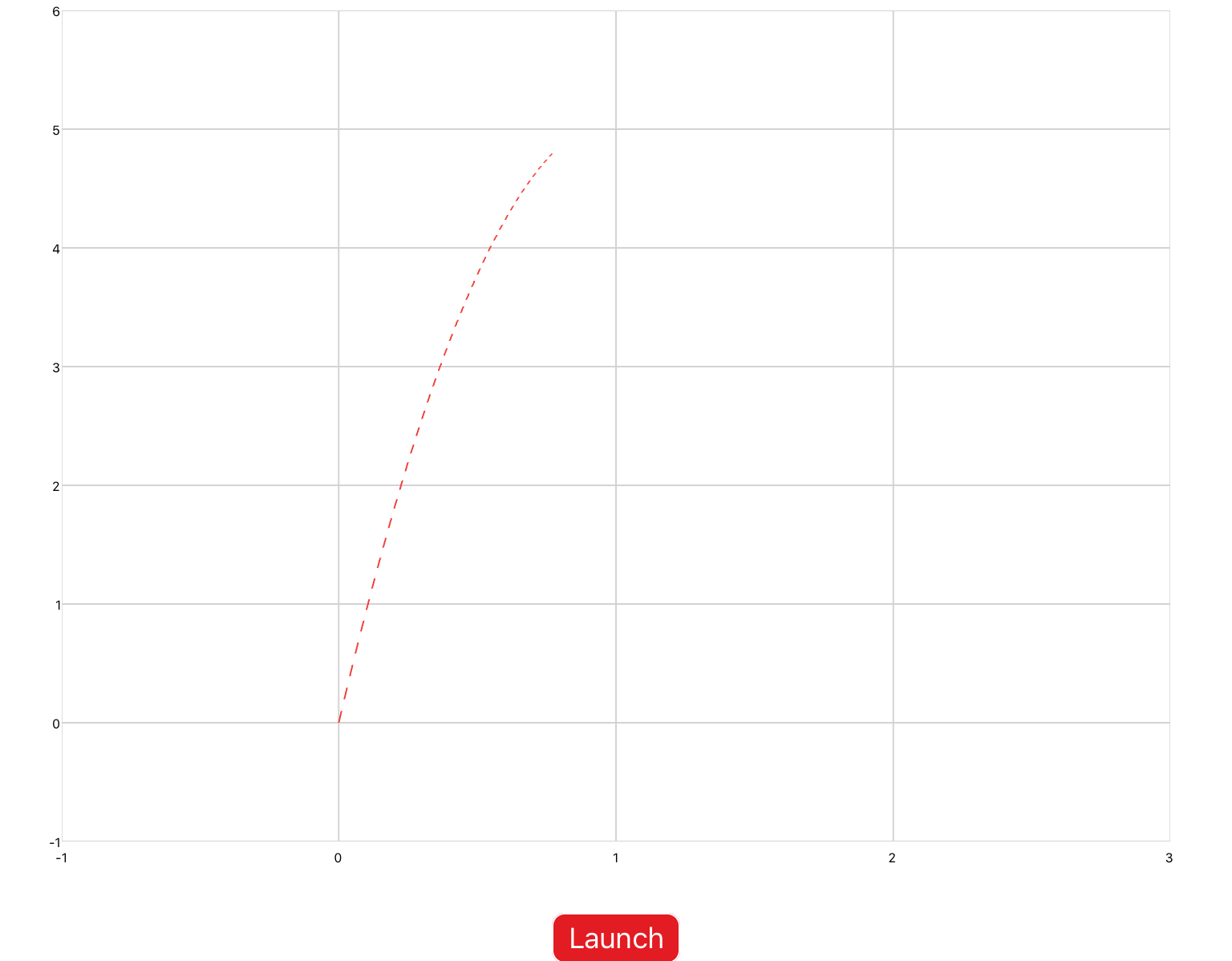
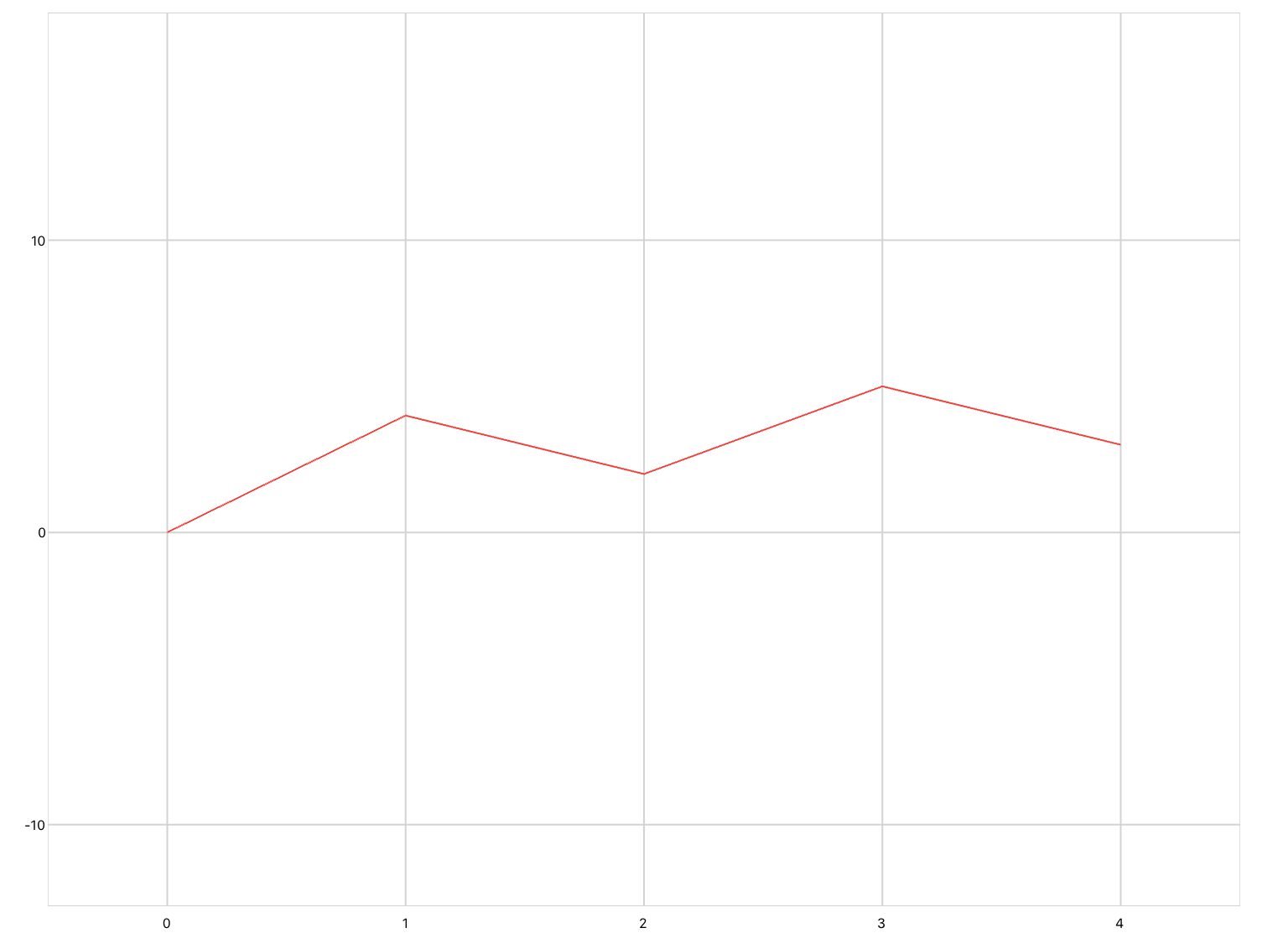
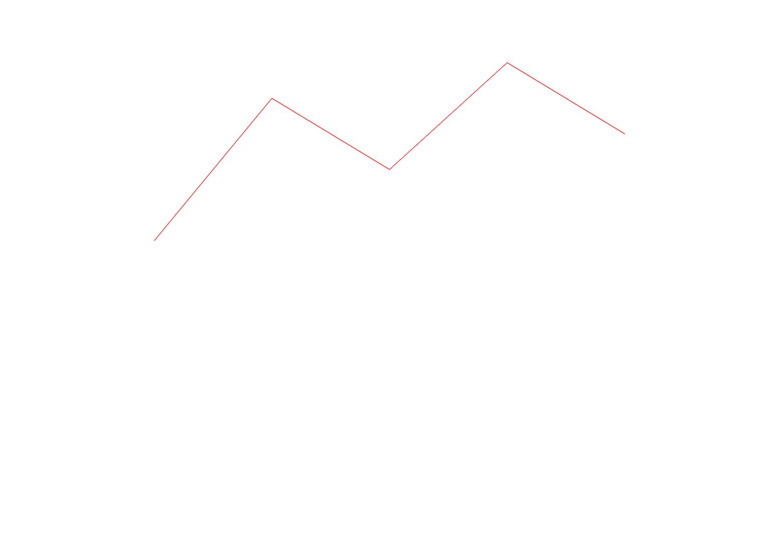
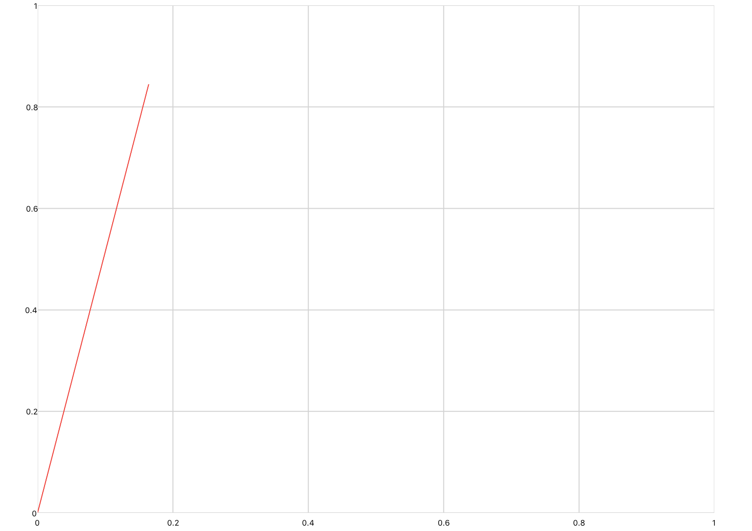
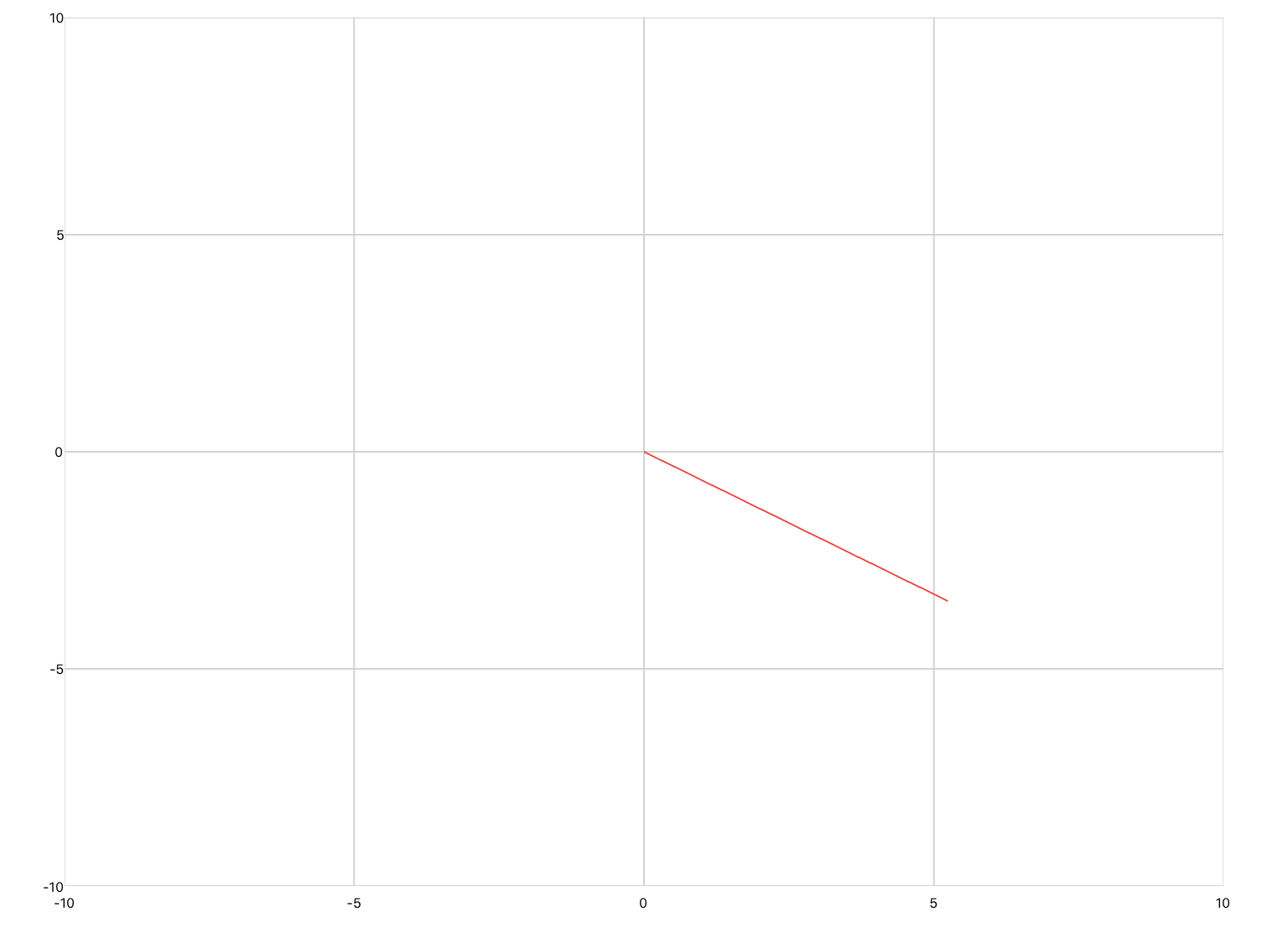
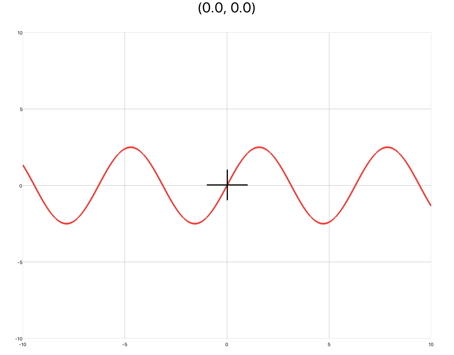
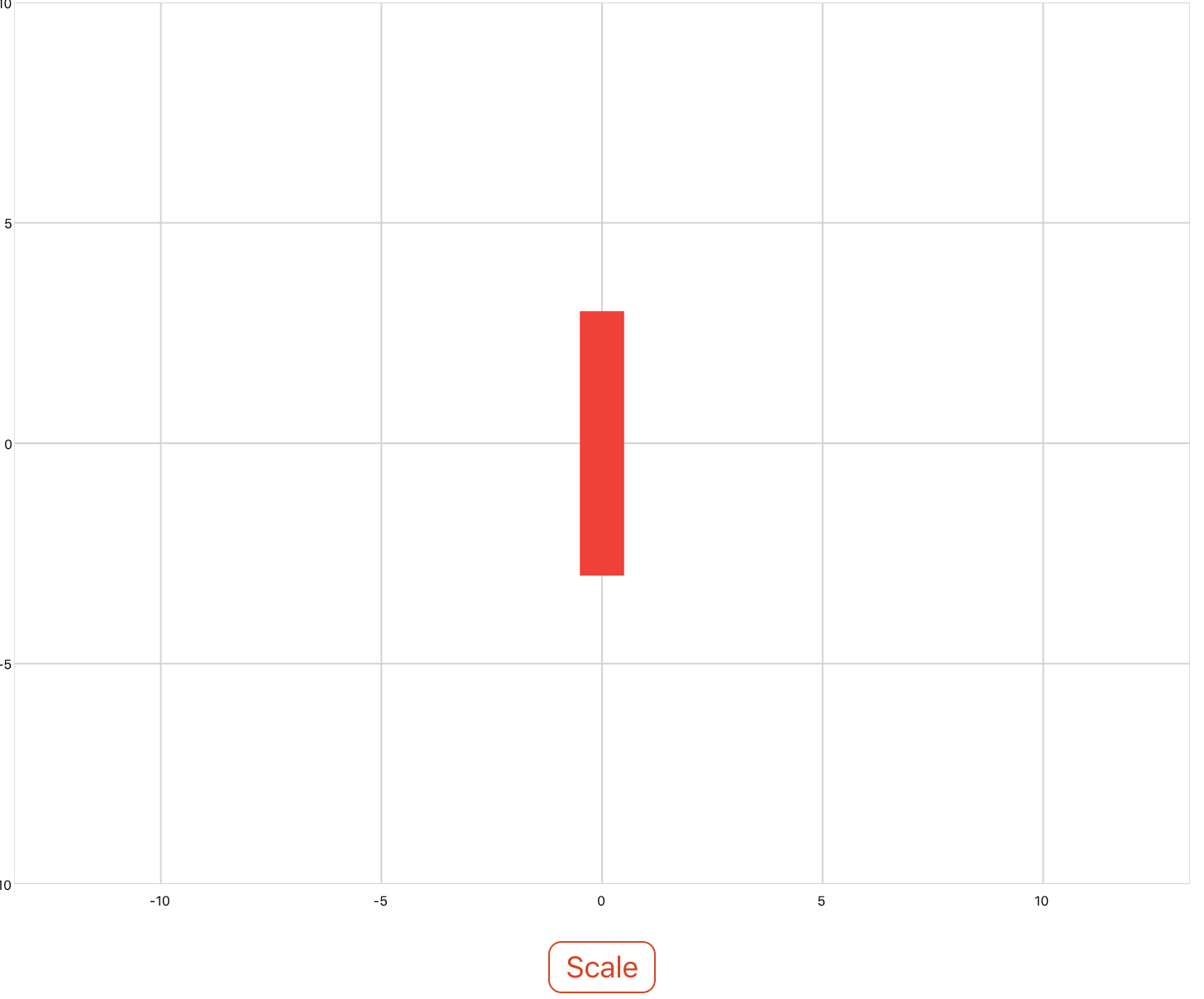
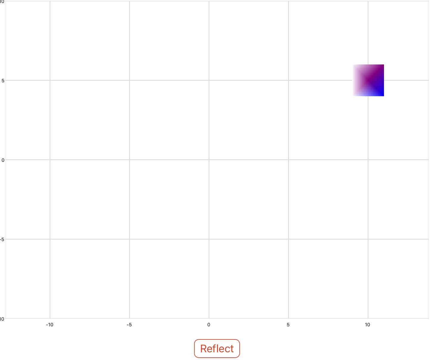
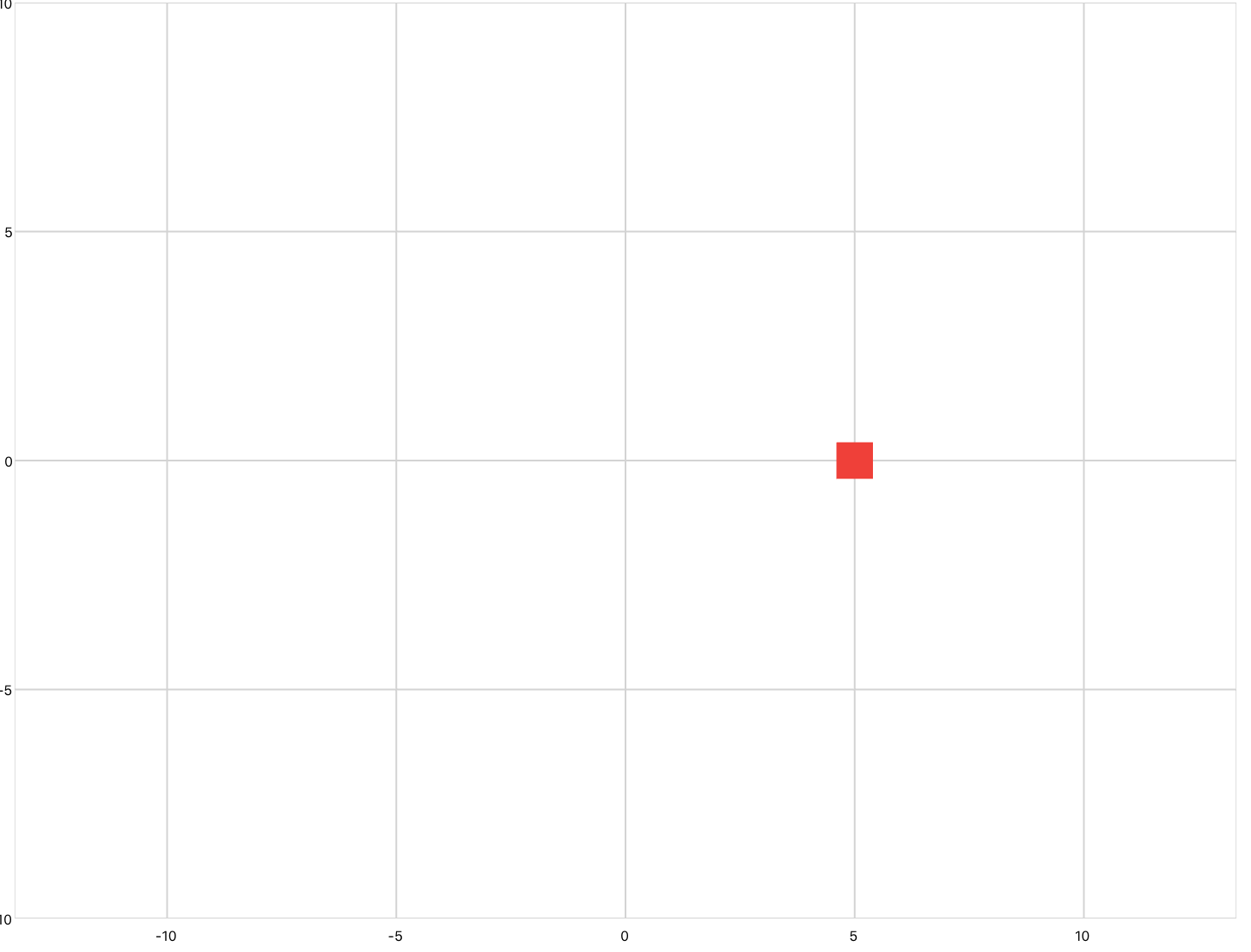
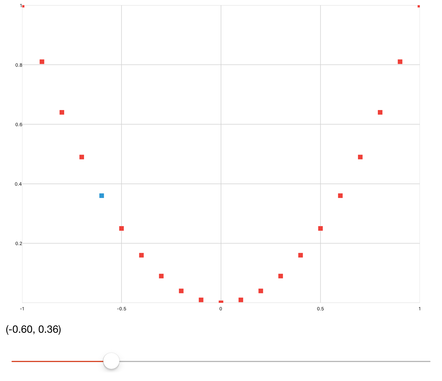
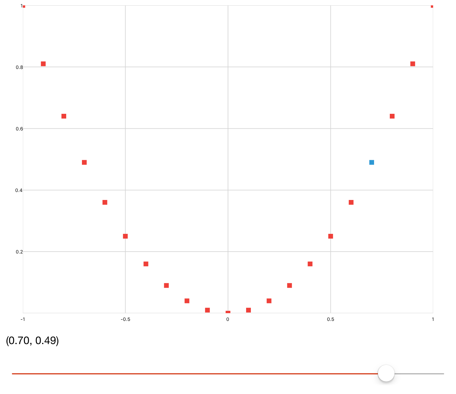
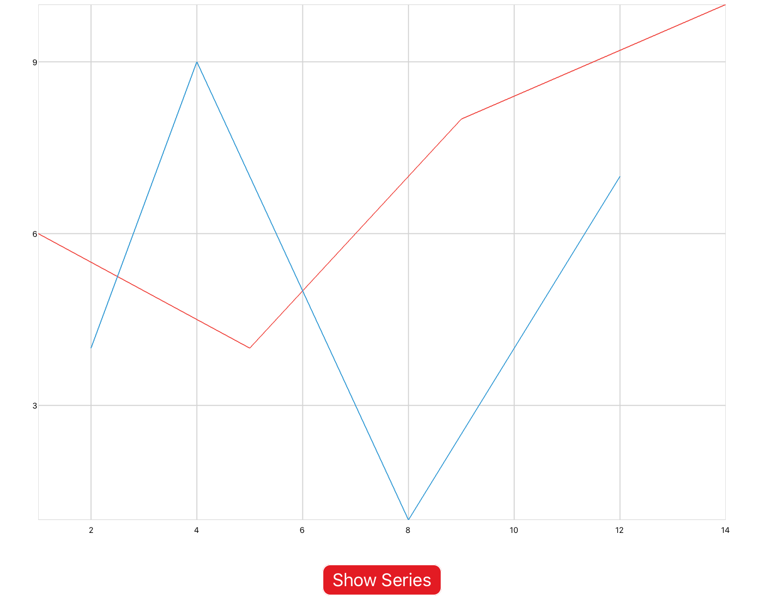
Example 1: xyPlot

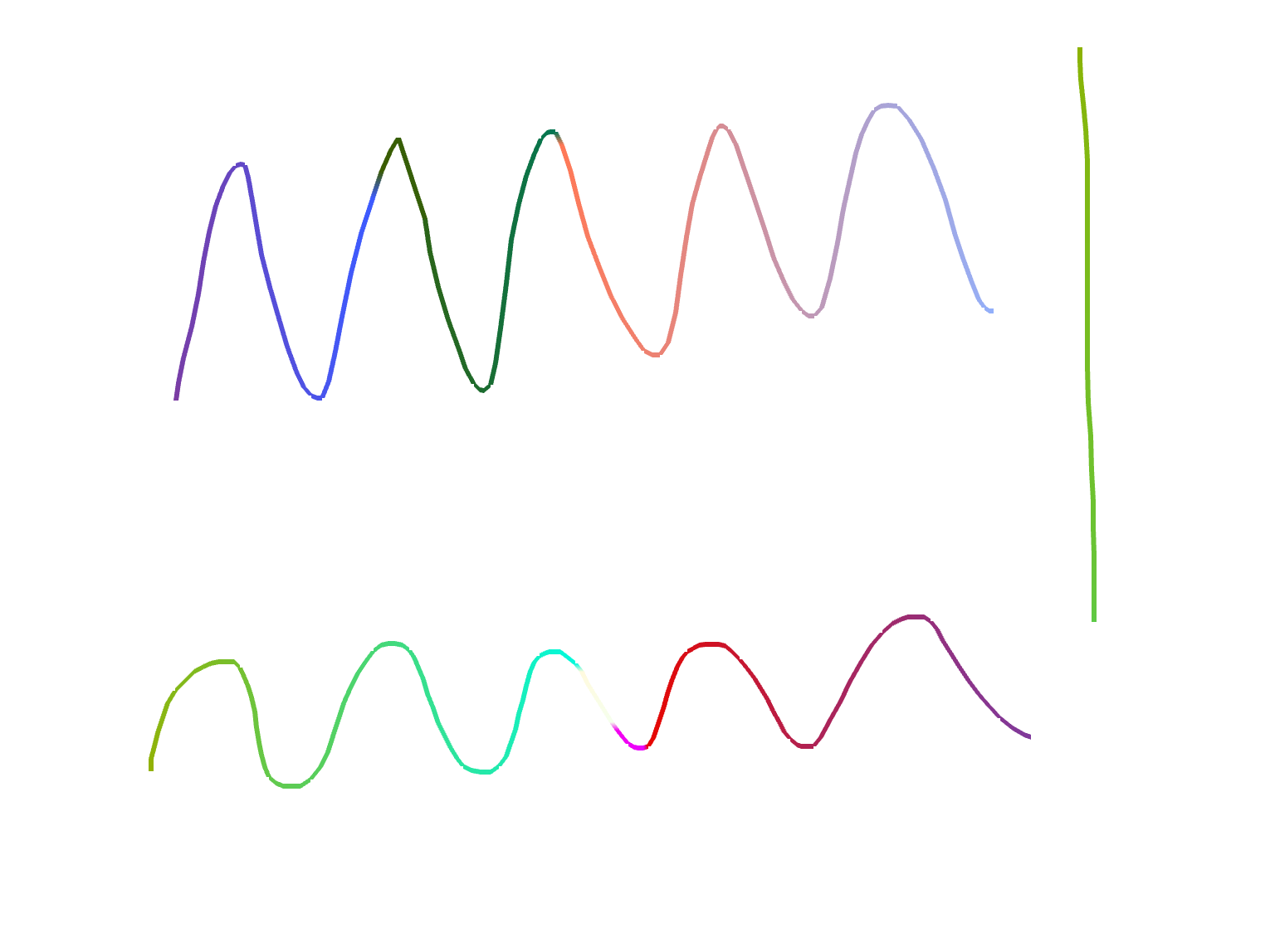
xyPlot are line plots whose inputs are Cartesian coordinates of the form (x,y). Pan/zoom is enabled by default. You would use this plot if you were inputting raw data, or animating a concept that requires axis labels.

You can copy this example into your document as-is.

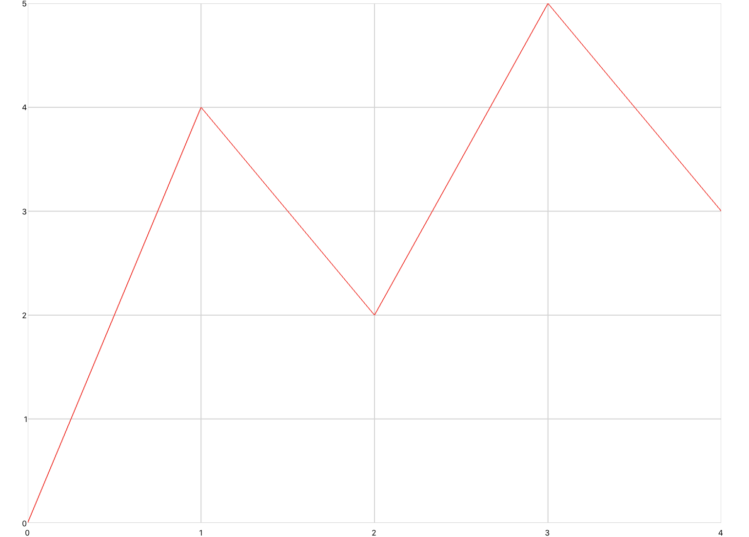
<xyPlot>
  <series>
    <data>0 0; 1 2; 2 -3; 3 5</data>
  </series>
</xyPlot>
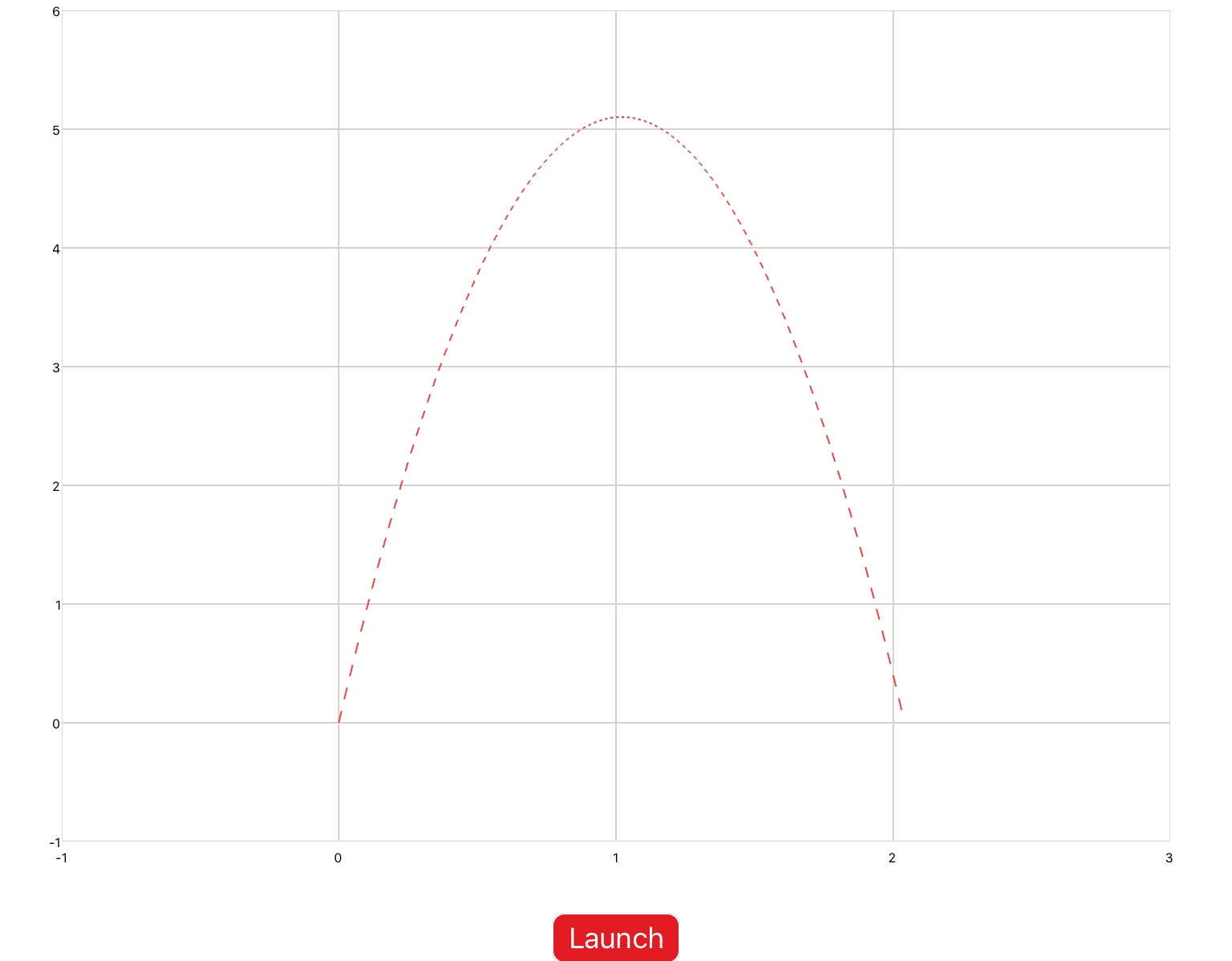
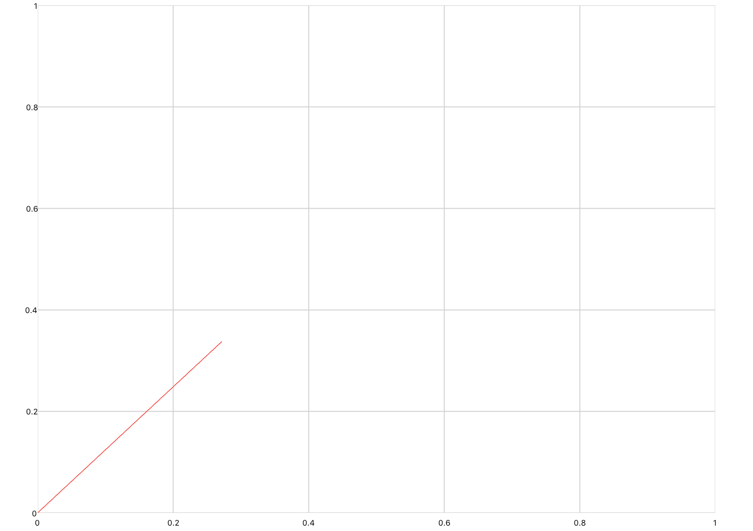
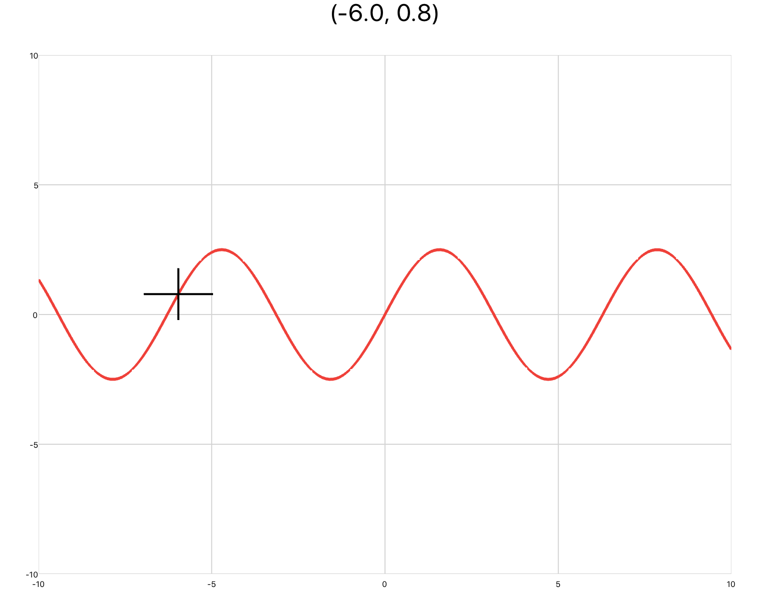
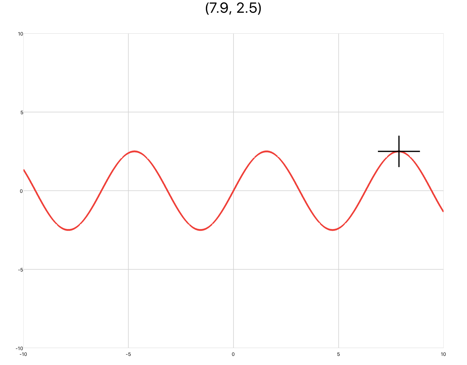
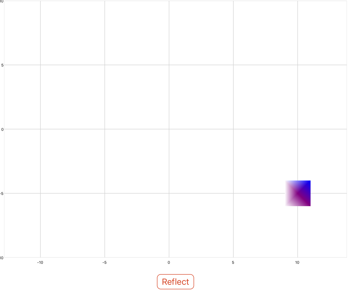
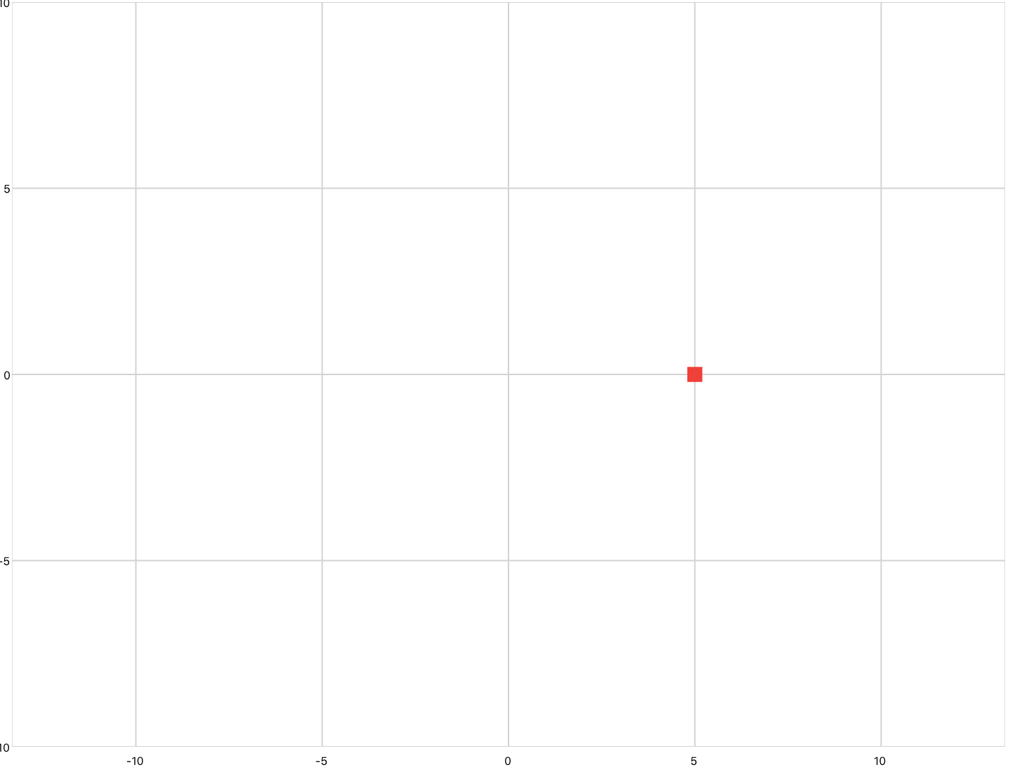
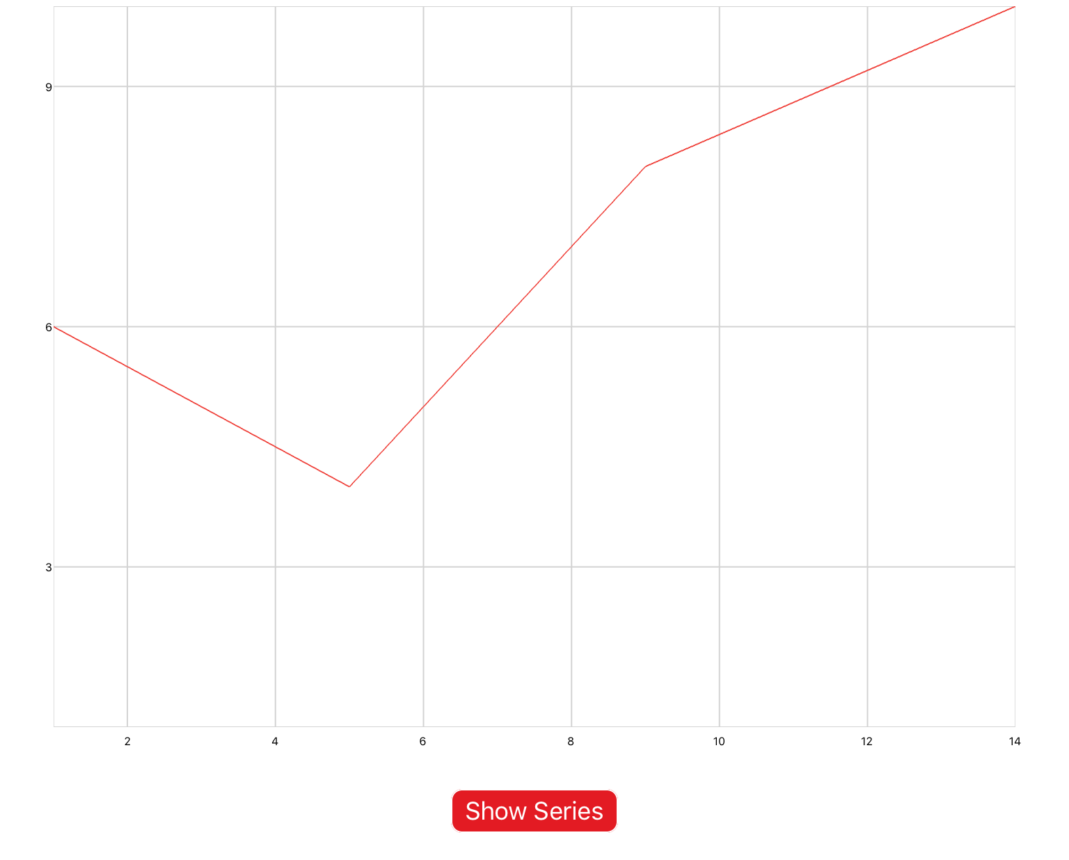
 
xyplot.jpg
 

Example 2: timePlot

The second is timePlot, which defines a line plot whose inputs are Cartesian coordinates of the form (t,y), where the x-axis represents time. Pan/zoom is enabled by default. You would use this plot to output the results of a simulation. 

You can copy this example into your document as a top-level section (i.e. not inside any other sections).

<sectionNoTitle name="section2">
  
  <timePlot name="myPlot" />

  <simulation name="sineSim">
    <onActivePageChanged>
      if active then
        sineSim:Start()
      else
        sineSim:Stop()
      end
    </onActivePageChanged>
    <solver>
      <series>
        <sine />
        <probe ref="section2.myPlot" />
      </series>
    </solver>
  </simulation>

</sectionNoTitle>
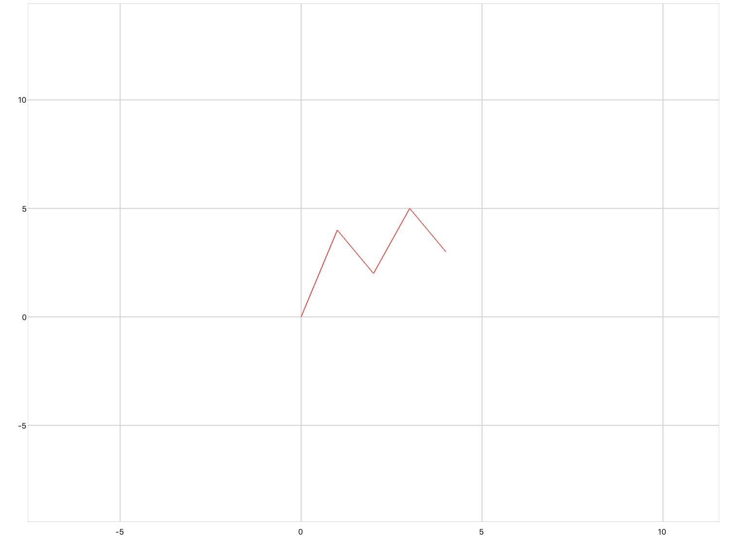
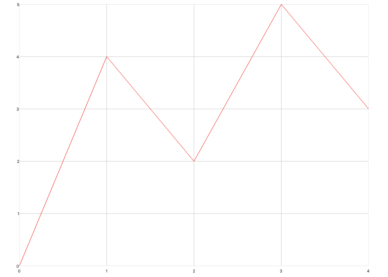
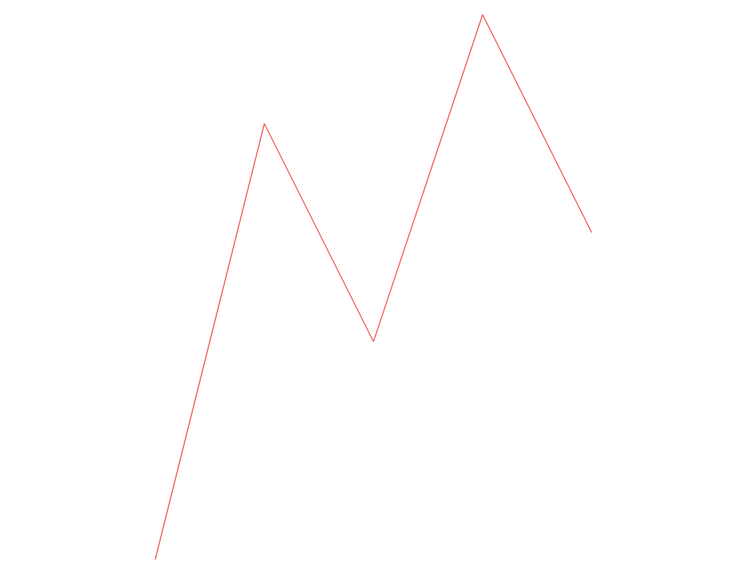
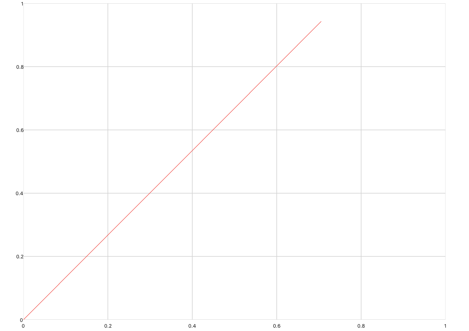
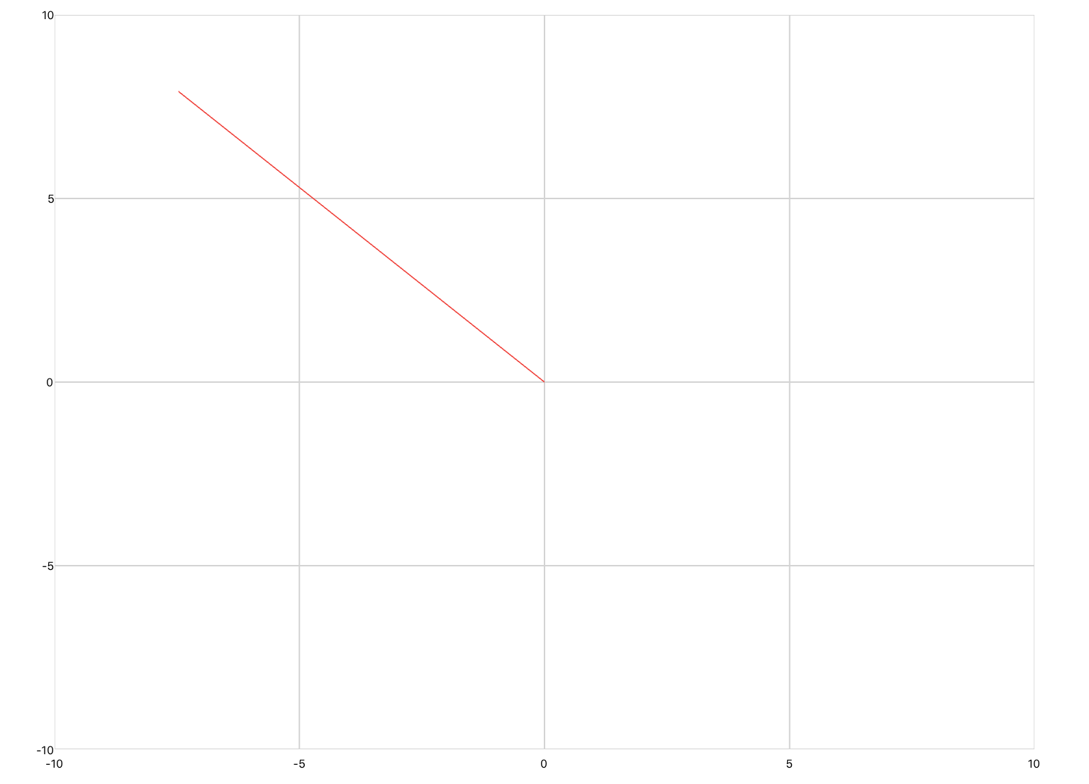
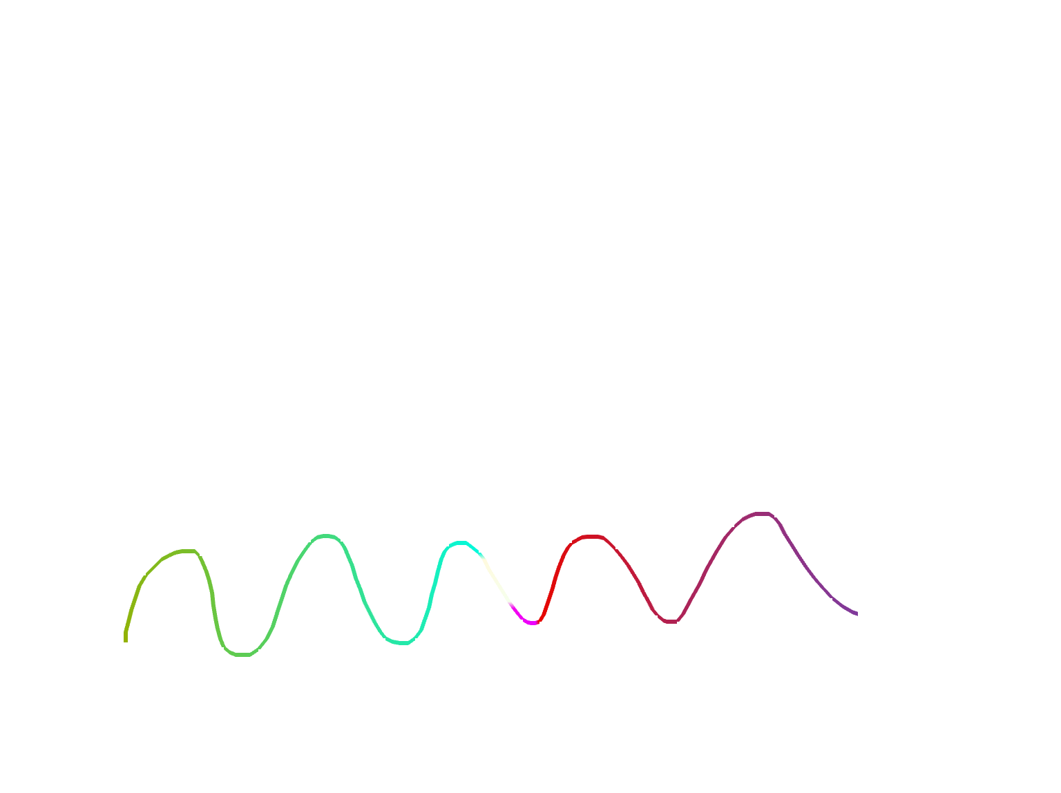
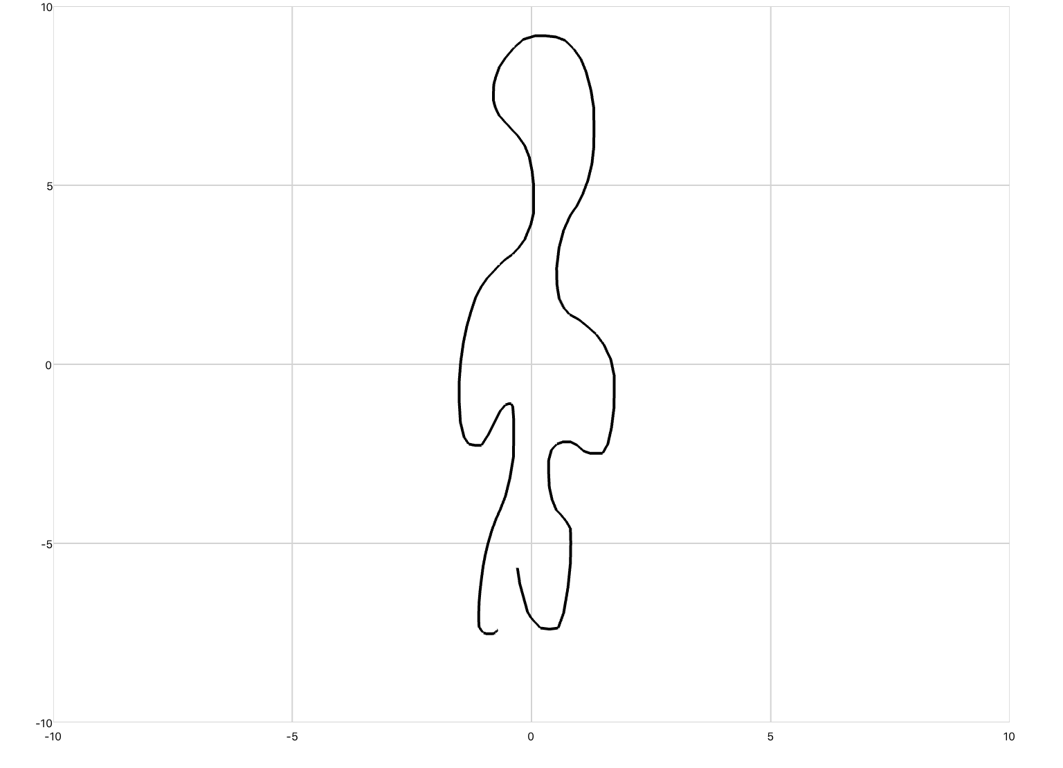
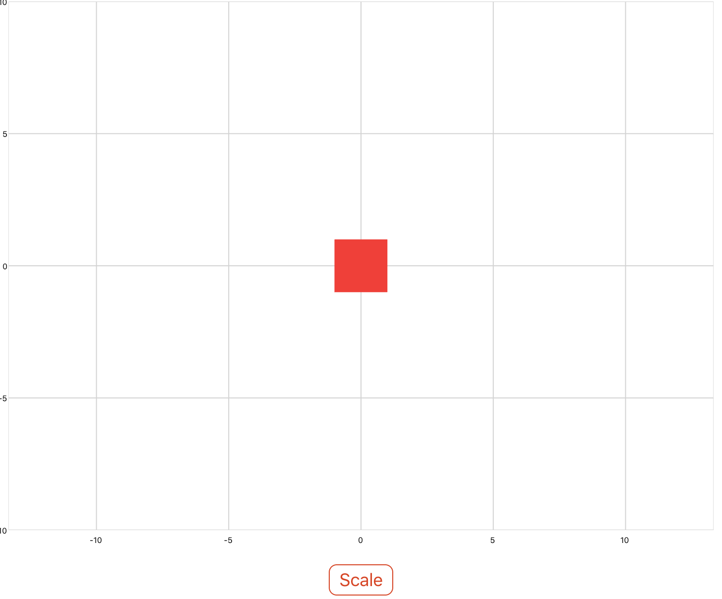
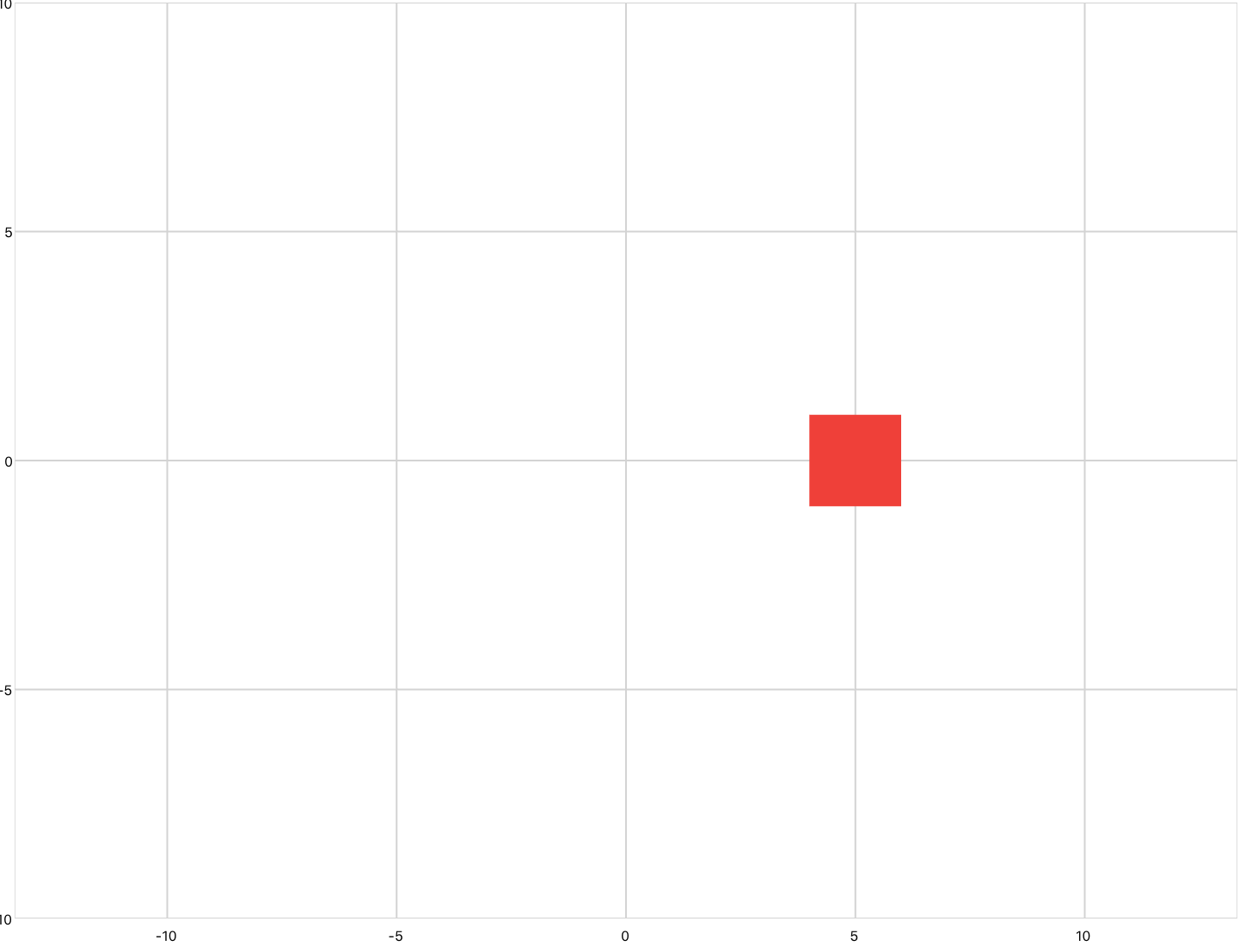
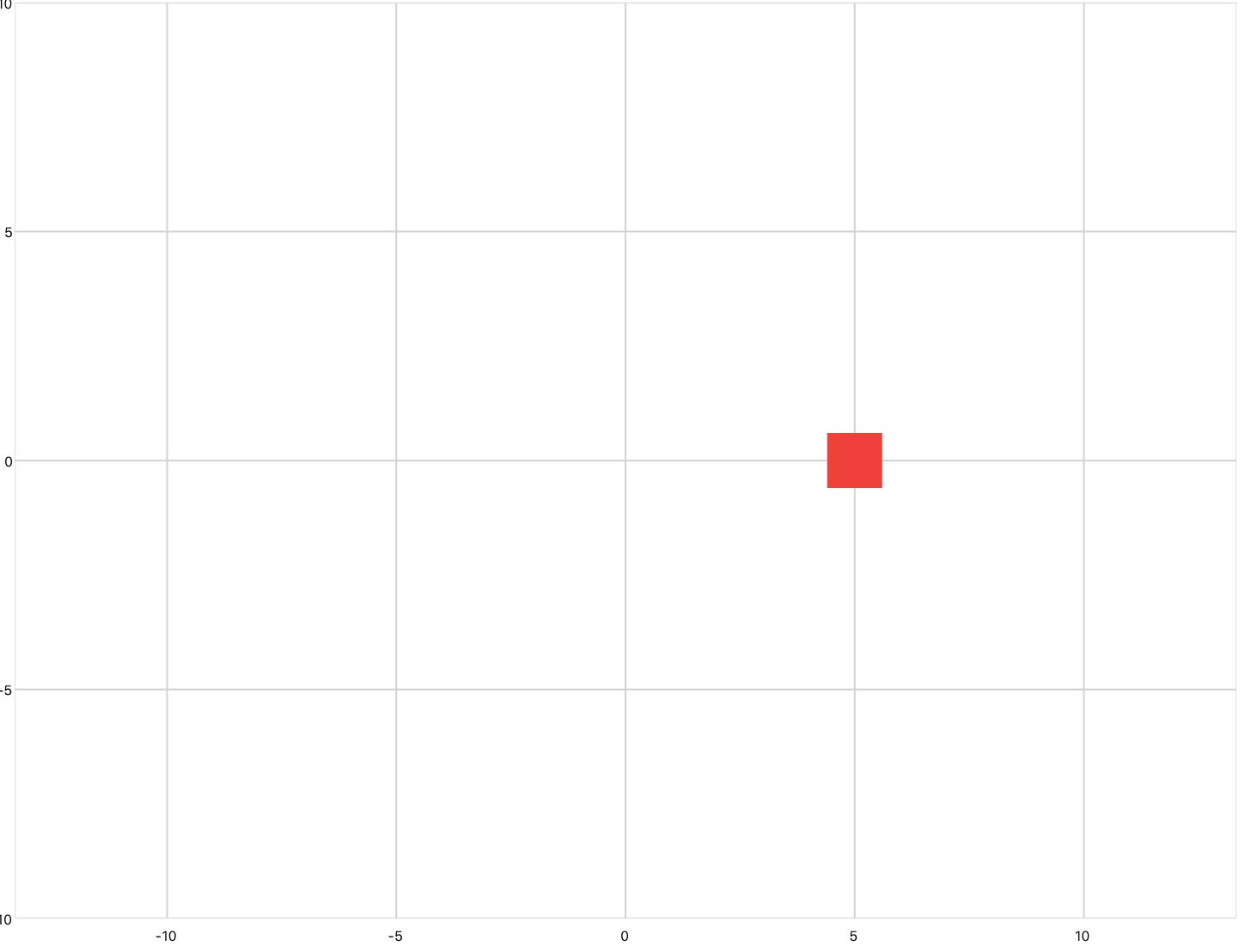
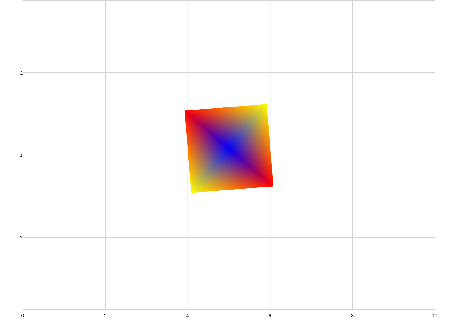
 
timeplot.jpg
 

Example 3: Drawing

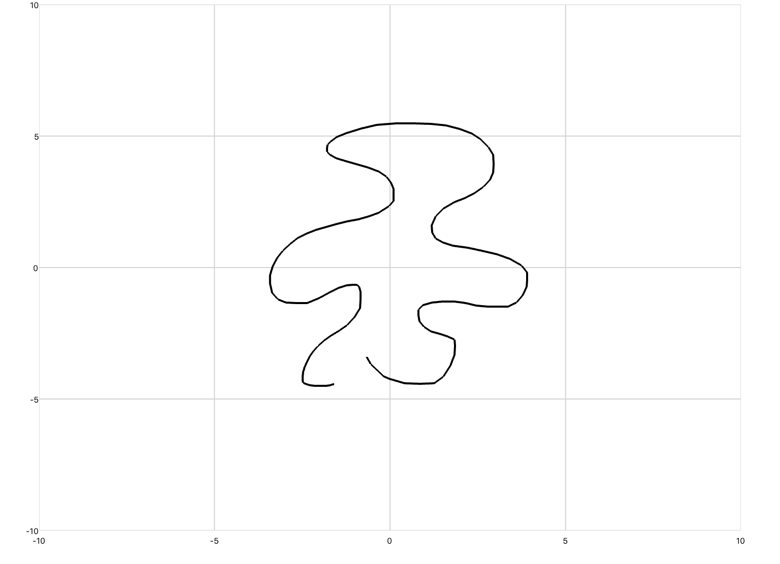
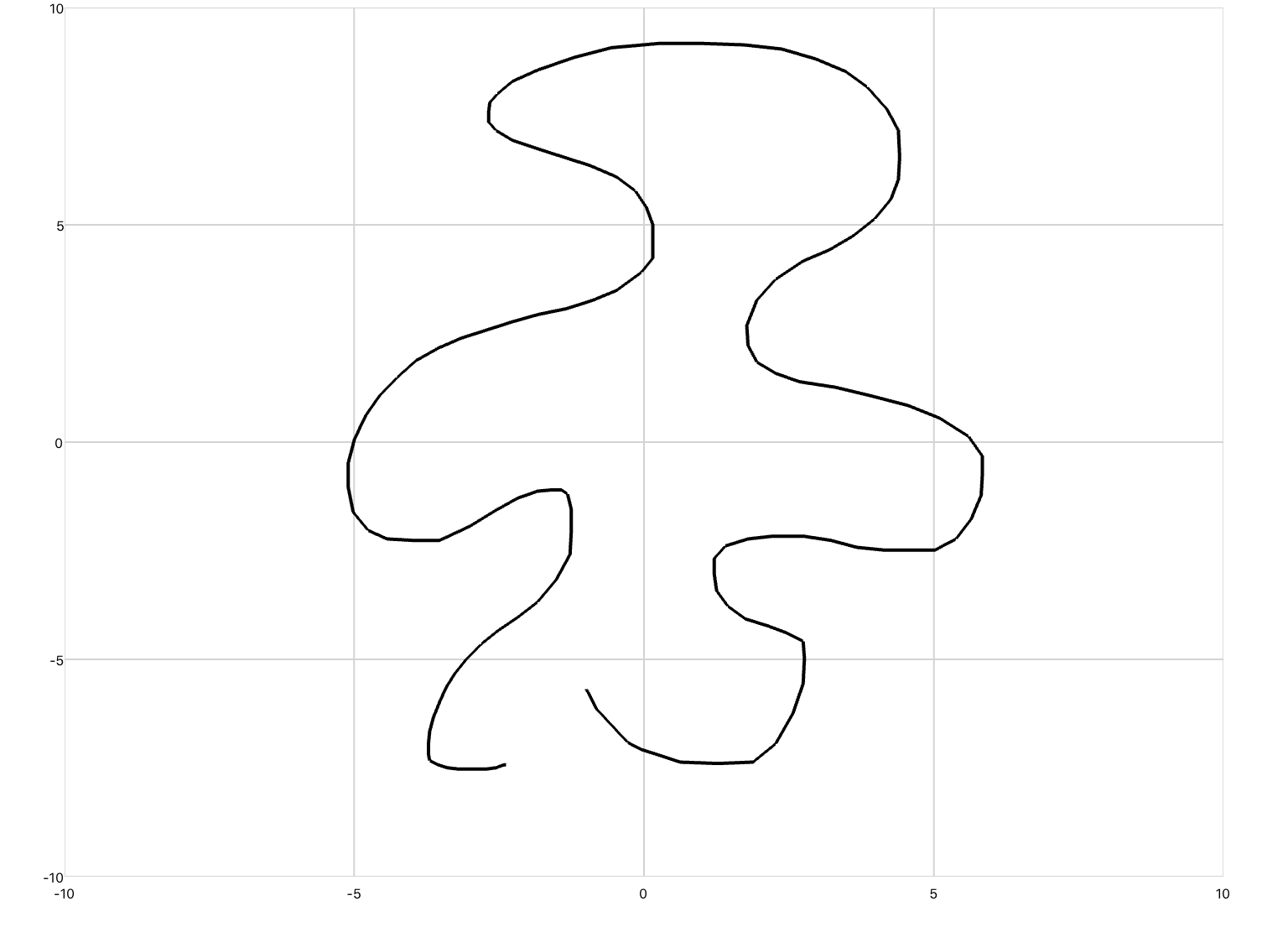
The third is drawing, which defines a line plot whose inputs are Cartesian coordinates of the form (x,y). Drawing differs from xyPlot and timePlot in that gridlines are not displayed, and pan/zoom is disabled. You would use this plot if you were animating a realistic-looking concept.

You can copy this example into your document as-is.

<drawing>
  <series>
    <data>0 0; 1 2; 2 -3; 3 5</data>
  </series>
</drawing>
 
drawing.jpg
 

Plotting Equations

At this time, qdex does not allow you to simply input an equation and plot it automatically. To plot any equation, you must create a for-loop inside of a script that calculates the y value of said equation, then adds (x,y) points to a buffer on each iteration. When the for-loop is finished, the Update method is called to add the specified points to the plot. 

Example 1

This example plots the equation 4x^3 - x + 9 over the range -100 to 100.

You can copy this example into your document as-is.

<xyPlot name="myPlot">
  <series name="aSeries" manual="true"/>
</xyPlot>

<script>
  local x, y;
  local plotPointer = myPlot.aSeries;

  for x = -100, 100, 1 do
  y = 4*math.pow(x,3) - x + 9
  plotPointer:Add(x,y)
  end
  plotPointer:Update()
</script>
plot-equation.jpg

Example 2

This example plots the equation 2sin(x) over the range -10 to 10. A smaller increments of 0.1 is used in the for-loop to ensure that the wave is plotted smoothly. The lineSegments draw mode is used to draw a dotted line. 

You can copy this example into your document as-is.

<xyPlot name="newPlot">
  <series name="mySeries" draw="lineSegments" manual="true" />
</xyPlot>

<script>
  local x, y;
  local sinePlot = newPlot.mySeries;

  for x = -10, 10, 0.1 do
  y = 2*math.sin(x)
  sinePlot:Add(x,y)
  end
  sinePlot:Update()
</script>
plot-sine.jpg

Example 3

It is possible to add points to a plot without explicitly defining the series in that plot. 

This example plots three equations over the range of -10 to 10. Notice that the three series are not defined by name in the plot declaration, and instead defined as a plot attribute.

You can copy this example into your document as-is.

<xyPlot name="thisPlot" series="3" />

<script>
  for x = -10, 10, 0.1 do
    y1 = 2*math.pow(x,2)
    y2 = 0.5*math.pow(x,3)
    y3 = 0.25*math.pow(x,4)
    thisPlot.Series[1]:Add(x,y1)
    thisPlot.Series[2]:Add(x,y2)
    thisPlot.Series[3]:Add(x,y3)
  end   
</script>
plot-multiple-equations.jpg

CSV File Data

You can also plot values from a comma-separated-value (CSV) list. This works well if you have large amounts of data, or you are generating your data from third-party programs such as MATLAB (qdex supports CSV files created using the MATLAB command csvwrite). Just ensure that you include the file in the resources folder. 

Example 1

You cannot copy this example into your document as-is. You must first create a CSV file of values and include it in the resources folder of your project.

<xyPlot>
  <series>
    <data src="resources\noisy_sine_wave.csv"/>
  </series>
</xyPlot>
 
plot-csv-data.jpg
 

The color of each individual point in the CSV file can be specified using per-vertex colors

Plots for Animation

Sprite-like animations can be drawn in qdex by manually adding, deleting, and updating points on a plot. Simulations are used to calculate time or the dynamics of the drawn system, and (x,y) points are added on each iteration. If you would like to add images to your plots and manipulate them with controls or through simulation, refer to Texture Basics.

Example 1

In this example, a simulation is used to calculate the current time of a projectile after launch. A button is used to start the simulation (i.e. launch the projectile). When the simulation runs it updates the current time and calls a function to draw the projectile. The function also checks that the y-value of the current position is greater than 0 so that the projectile stops when it hits the "ground".

The series' manual attribute is set to true, meaning that (x,y) coordinates will not be added or removed from the series until you call the Update method (See Plot Flickering below for more information). The plot is also cleared each time the button is pushed to allow the animation to be redrawn each time the projectile is launched. 

You can copy this example into your document as-is.

<sectionNoTitle>  
  <xyPlot name="aPlot">
    <axis dim="x" auto="fixed" min="-1" max="3" />
    <axis dim="y" auto="fixed" min="-1" max="6" />
    <series name="arcSeries" manual="true" draw="lineSegments" />
  </xyPlot>

  <script>
    <![CDATA[
    local plotArc = aPlot.arcSeries;
    local curTime = 0;
    local startSpeed = 10;

    local function drawArc()
    y = startSpeed*curTime + 0.5*-9.8*(curTime^2)
    
    if y >= 0 then      
    plotArc:Add(curTime, y)
    plotArc:Update()
    else
    arcSim:Stop()
    end
    
    end
    ]]>    
  </script>

  <button content="Launch">
    <onClick>
      plotArc:Clear()        
      arcSim:Start()
    </onClick>
  </button>

  <simulation name="arcSim" period="0.01" duration="5">
    <onUpdate>
      curTime = time;
      drawArc()
    </onUpdate>
  </simulation>
</sectionNoTitle>


Example 2

This example uses a custom simulation system to calculate (x,y) coordinates. On each iteration of the simulation the sine and cosine of the simulation clock is calculated, and the points (0,0) and (sine, cosine) are plotted. The result is a two-point line that rotates around a circle. 

Note that the capacity of the series is set to 2, as only two points should be plotted at one time. If you do not set the capacity of the series, you can call the Clear method before adding points.

This plot includes a second series of transparent points in a square formation to force the plot to center on the rotating line. If this series was not included, the y axis would shift (due to the lockAspectRatio setting) with the animation, and the (0,0) coordinate would not stay centered. We recommend using this transparent frame method each time you create an animation that uses lockAspectRatio.

You can copy this example into your document as-is.

<sectionNoTitle>
  <drawing name="myAnimation">
    <axis dim="x" auto="fixed" min="-2" max="2" />
    <axis dim="y" auto="lockAspectRatio" />
    <series name="mySeries" manual="true" capacity="2" />
    <series>
      <data>-1 -1; -1 1; 1 1; 1 -1; -1 -1</data>
      <colors>transparent; transparent; transparent; transparent; transparent</colors>
    </series>
  </drawing>

  <script>
    local plotC = myAnimation.mySeries;
  </script>

  <simulation name="circleSim">
    <onActivePageChanged>
      circleSim:Start()
    </onActivePageChanged>
    <solver>
      <series>
        <clock />
        <system>
          <input name="data" width="1" />
          <onOutputs>
            val1 = math.sin(data[1])
            val2 = math.cos(data[1])
            
            plotC:Add(0,0, color.teal)
            plotC:Add(val1, val2, color.aqua)
            plotC:Update()
          </onOutputs>
        </system>
      </series>
    </solver>
  </simulation>
  
</sectionNoTitle>


Plot Flickering

If you have attempted to create an animation using a plot in qdex, you may have noticed a lot of flickering when the animation is changed. This is because when animating shapes on plots (that is, drawing/erasing points in quick succession), the user notices the pause between erasing points and adding new points.

You can stop this flickering effect by setting the manual attribute on the series to "true". When manual="true", the series will not erase or add points until the Update method is called. In this way you can erase the old points and add new ones at effectively the same time, removing the flicker altogether. 

Animation that Flickers

<script>
  local d = 1

  local function drawShape()
    -- Clear all points
    plot1.shape:Clear()
    -- Draw points
    plot1.shape:Add(-1*d, -1*d)
    plot1.shape:Add(1*d, -1*d)
    plot1.shape:Add(1*d, 1*d)
    plot1.shape:Add(-1*d, 1*d)
    plot1.shape:Add(-1*d, -1*d)
    plot1.shape:Add(0, 0.5*d+d)
    plot1.shape:Add(1*d, 1*d)
  end
</script>


<xyPlot name="plot1">
  <axis dim="x" auto="lockAspectRatio" />
  <axis dim="y" auto="fixed" min="-15" max="20" />
  <series name="shape" draw="segmentedFill" />
</xyPlot>

<slider min="1" max="10">
  <onValueChanged>
    d = value
    drawShape()
  </onValueChanged>
</slider>
Animation that flickers

Animation that flickers

Animation with Flickering Removed

<script>
  local d = 1

  local function drawShape()
    -- Clear all points
    plot1.shape:Clear()
    -- Draw points
    plot1.shape:Add(-1*d, -1*d)
    plot1.shape:Add(1*d, -1*d)
    plot1.shape:Add(1*d, 1*d)
    plot1.shape:Add(-1*d, 1*d)
    plot1.shape:Add(-1*d, -1*d)
    plot1.shape:Add(0, 0.5*d+d)
    plot1.shape:Add(1*d, 1*d)
    -- Update series
    plot1.shape:Update()
  end
</script>

<xyPlot name="plot1">
  <axis dim="x" auto="lockAspectRatio" />
  <axis dim="y" auto="fixed" min="-15" max="20" />
  <series name="shape" manual="true" draw="segmentedFill" />
</xyPlot>

<slider min="1" max="10">
  <onValueChanged>
    d = value
    drawShape()
  </onValueChanged>
</slider>
Animation with no flicker

Animation with no flicker

Gestures

Gestures allow users to pan and zoom into plots to analyse points and trends. However, gestures can also be used to control plot elements or draw new points. By default, gestures are enabled through tapping for xyPlots and timePlots, and completely disabled for drawings.

Enable/Disable All

You can completely enable or disable gestures by setting the manual attribute inside your plot declaration to true or false. See the example below.

Disabled Gestures

Default

<xyPlot manual="false">
  <axis dim="x" />
  <axis dim="y" />
  <series>
    <data>0 0; 1 4; 2 2; 3 5; 4 3</data>
  </series>
</xyPlot>
<xyPlot manual="true">
  <axis dim="x" />
  <axis dim="y" />
  <series>
    <data>0 0; 1 4; 2 2; 3 5; 4 3</data>
  </series>
</xyPlot>
no-gesture-plot.jpg

When manual is set to true, plots will pan and zoom as soon as they are touched. If the manual attribute is not set, the plot must first be tapped on to enable gestures.

Enable/Disable Individual

You can enable or disable individual gestures by setting the pan, tap or zoom plot attributes to enabled or disabled. Note that on a drawing plot you also need to set manual to true.

<xyPlot zoom="disabled">
  <series>
    <data>0 0; 1 4; 2 2; 3 5; 4 3</data>
  </series>
</xyPlot>
<drawing zoom="enabled" tap="enabled" pan="enabled" manual="true">
  <series>
    <data>0 0; 1 4; 2 2; 3 5; 4 3</data>
  </series>
</drawing>

Custom Gestures

To use custom gestures, set the pan, tap, or zoom attributes to custom. You can then access the onTap, onPan and onZoom events.

By default, all gestures are limited to the range 0-1 in the x and y axes. If you would like to use a custom gesture on a different range you need to scale the gesture input.

Tap

The coordinates of the tap gesture can be accessed using the inherent variables x and y in the onTap event.

In the below example, a line is drawn between (0,0) and the point that is tapped.

<xyPlot name="tapPlot" tap="custom">
  <axis dim="x" min="0" max="1" auto="fixed" />
  <axis dim="y" min="0" max="1" auto="fixed" />
  <onTap>
    mySeries:Add(0, 0)
    mySeries:Add(x, y)
  </onTap>
  <series name="mySeries" capacity="2" />
</xyPlot>


In this next example, a line is drawn between (0,0) and the point that is tapped. The point is first scaled to to an axis range of -10 to 10 in the x and y axes.

<xyPlot name="tapPlot2" tap="custom">
  <axis dim="x" min="-10" max="10" auto="fixed" />
  <axis dim="y" min="-10" max="10" auto="fixed" />
  <onTap>
    scaledX = tapPlot2.XAxis.Min + x * (tapPlot2.XAxis.Max - tapPlot2.XAxis.Min);
    scaledY = tapPlot2.YAxis.Min + y * (tapPlot2.YAxis.Max - tapPlot2.YAxis.Min);
    series:Add(0, 0)
    series:Add(scaledX, scaledY)
  </onTap>
  <series name="series" capacity="2" />
</xyPlot>


Pan

The coordinates of the pan gesture can be accessed using the inherent variables state.Current.X and state.Current.Y in the onPan event.

The first example uses the pan gesture to draw a cursor over the plotted curve. As your finger moves along the x-axis the cursor is drawn.

<script>
  for x = -10,10,0.1 do
  y = 2.5*math.sin(x)
  myPlot.curve:Add(x,y)
  end
</script>

<p name="cursorLabel">
  <style>
    <textAlignment>center</textAlignment>
    <size scale="large" />
  </style>
</p>

<xyPlot name="myPlot" pan="custom">
  <axis dim="x" auto="fixed" min="-10" max="10" />
  <axis dim="y" auto="growOnly" min="-10" max="10" /> 
  <onPan>
    local x = myPlot.XAxis.Min + state.Current.X * (myPlot.XAxis.Max - myPlot.XAxis.Min);
    
    y = 2.5*math.sin(x)

    cursor:Add(x-1,y)
    cursor:Add(x+1,y)
    cursor:Add(x,y-1)
    cursor:Add(x,y+1)
    
    cursorLabel.Text = string.format("(%0.1f, %0.1f)", x, y)
  </onPan>
  <series name="curve">
    <style>
      <lineThickness>3</lineThickness>
    </style>
  </series>
  <series name="cursor" draw="lineSegments" capacity="4">
    <style>
      <foreground color="black" />
      <lineThickness>2</lineThickness>
    </style>
  </series>
</xyPlot>


In this next example the pan gesture is used to draw on a plot. A function is used to update the color of each point that is drawn.

<script>
  <![CDATA[
  local red = 255
  local green = 0
  local blue = 0
  local myColor = color.rgb(red, green, blue)
    
  function updateColor()
  red = red - 2 
  if red < 2 then red = 255 end
  green = green + 1
  if green > 255 then green = 0 end
  blue = blue + 3
  if blue > 255 then blue = 0 end
  myColor = color.rgb(red, green, blue)
  end
  ]]>
</script>

<drawing name="panPlot" pan="custom" manual="true">
  <axis dim="x" min="-10" max="10" auto="fixed" />
  <axis dim="y" min="-10" max="10" auto="fixed" />
  <onPan>
    local x = panPlot.XAxis.Min + state.Current.X * (panPlot.XAxis.Max - panPlot.XAxis.Min);
    local y = panPlot.YAxis.Min + state.Current.Y * (panPlot.YAxis.Max - panPlot.YAxis.Min);

    if state.IsStart then
      panSeries:Add(oldX,oldY,color.transparent)
      panSeries:Add(x,y,color.transparent)
      panSeries:Add(x,y,myColor)
    else
       panSeries:Add(x,y,myColor)
    end
    
    oldX = x
    oldY = y
    updateColor()
  </onPan>
  <series name="panSeries" capacity="300">
    <style>
      <lineThickness>3</lineThickness>
    </style>
  </series>
</drawing>

The transparent points are added to separate the drawn lines from each other. 


Zoom

The zoom gesture is a little different than the pan and tap gestures in that it does not return coordinates. The values returned represent x and y scale factors, and can be accessed using the inherent variables x and y in the onZoom event.

In this example the pan gesture is used to draw on a plot. The zoom gesture can then be used to resize the drawn object through matrix transforms. 

<script>
  <![CDATA[
  local deltaX = 1
  local deltaY = 1      
  
  local minX = 0
  local maxX = 0
  local minY = 0
  local maxY = 0  

  function findMinMax(x,y)
    if x < minX then minX = x end
    if x > maxX then maxX = x end
    if y < minY then minY = y end
    if y > maxY then maxY = y end
  end
  ]]>
</script>

<xyPlot name="thisPlot" zoom="custom" pan="custom">
  <axis dim="x" min="-10" max="10" auto="fixed" />
  <axis dim="y" min="-10" max="10" auto="fixed" />
  <onPan>
    <![CDATA[        
    local a = thisPlot.XAxis.Min + state.Current.X * (thisPlot.XAxis.Max - thisPlot.XAxis.Min);
    local b = thisPlot.YAxis.Min + state.Current.Y * (thisPlot.YAxis.Max - thisPlot.YAxis.Min);

    drawSeries:Add(a,b)
    findMinMax(a,b)
    ]]>
  </onPan>
  <onZoom>
    <![CDATA[
    x = x - 1;
    y = y - 1;

    if y ~= 0 then
    deltaY = deltaY + ( y * (maxY - minY));
    if deltaY < 0.1 then deltaY = 0.1 end
    end

    if x ~= 0 then
    deltaX = deltaX + ( x * (maxX - minX));
    if deltaX < 0.1 then deltaX = 0.1 end
    end
    
    drawSeries.Transform = matrixf.scaling(deltaX, deltaY, 1)
      ]]>
  </onZoom>
  <series name="drawSeries">
    <style>
      <foreground color="black" />
      <lineThickness>2</lineThickness>
    </style>
  </series>
</xyPlot>


Transforms

Plot transforms allow you to move or change points on a plot while maintaining the original series, without having to manually redraw the shape. They can be specified in XML using a transformation matrix, or through Lua by setting the appropriate parameters. Alternatively, you can use the animation tools fragment to easily perform the same manipulations with less effort.

A transformation matrix can be defined in XML inside of a series by using the transform element. For example, the following code uses a transformation matrix to rotate a square 45 degrees counter-clockwise.  

<drawing>
  <series draw="radialFill">
    <data>-1 -1; 1 -1; 1 1; -1 1</data>
    <transform>
        0.7071067811865476 -0.7071067811865475 0 0;
        0.7071067811865476  0.7071067811865475 0 0;
        0                   0                  1 0;
        0                   0                  0 1
    </transform>
  </series>
</drawing>
rotated-shape.jpg

From Lua you can use the Transform property of a series to rotate, translate, scale and reflect shapes without having to define a transformation matrix. See below.

Rotation

Use the rotationAboutAxis property to rotate shapes counterclockwise about a specified axis. The rotation angle should be specified in radians. Take a look at the below example, which uses a button to rotate a square in 45 degree (~0.785 rad) increments.

Note that the axis of rotation is at the origin. If you would like to rotate about a different point, the data must first be translated before being rotated. See Combining Transformations at the bottom of the page.

<xyPlot name="myPlot">
  <series name="series1" draw="radialFill">
    <data>0 0; 1 1; 1 -1; -1 -1; -1 1; 1 1</data>
    <colors>purple; red; blue; blue; red; red</colors>
  </series>
</xyPlot>

<script>
  angle = 0
</script>

<button content="Rotate">
  <onClick>
    myPlot.series1.Transform = matrixf.rotationAboutAxis(0, 0, 1, angle);
    angle = angle + 0.785;
  </onClick>
</button>


Translation

The translation property can be used to translate a shape along the x and y axes. In the below example, a square is shifted up and to the left using a simulation. 

<xyPlot name="myPlot">
  <series name="series3" draw="radialFill">
    <data>-5 0; -6 1; -6 -1; -4 -1; -4 1; -6 1</data>
  </series>
</xyPlot>

<script>
  x = 0
  y = 0
  z = 0
</script>

<simulation name="mySim">
  <onActivePageChanged>
    if active then
      mySim:Start()
    else
      mySim:Stop()
    end
  </onActivePageChanged>
  <onUpdate>
    myPlot.series3.Transform = matrixf.translation(x,y,z);
    x = x - 1
    y = y + 0.5
  </onUpdate>
</simulation>


Scaling

Use the scaling property to scale objects in the x and y directions. The scale is specified as a factor and can be specified as a uniform scale factor, as scale factors for each x, y, and z, or as a vector of scale factors.

The below example scales a square by different x and y factors. Note that the square is scaled about the origin. If you would like to scale about a different point, the data must first be translated before being scaled. See Combining Transformations at the bottom of the page. 

<xyPlot name="myPlot">
  <series name="series" draw="radialFill">
    <data>0 0; 1 1; 1 -1; -1 -1; -1 1; 1 1</data>
  </series>
</xyPlot>

<button content="Scale">
  <onClick>
    -- matrixf.scaling(factor x, factor y, factor z)
    myPlot.series.Transform = matrixf.scaling(0.5, 3, 1);
  </onClick>
</button>


Reflection 

The reflection property allows you to reflect shapes about the x and y axes by specifying the coefficients of the plane ax + by + cz = 0. In the example below a square is reflected about the y axis. 

<xyPlot name="myPlot">
 <series name="series4" draw="radialFill">
    <data>0 5; 1 6; 1 4; -1 4; -1 6; 1 6</data>
    <colors>purple; purple; blue; white; white; purple</colors>
  </series> 
</xyPlot>

<button content="Reflect">
  <onClick>
    myPlot.series4.Transform = matrixf.reflection(0,1,0);
  </onClick>
</button> 


Combining Transformations

Combine transformations by multiplying their transformation matrices together. Matrices should be multiplied in the following order:

Translation * Rotation * Scale.

Example 1

The below example uses a simulation to scale a square centered at (5,0). The square must first be translated to the origin, scaled, then translated back to (5,0). If the square was only scaled (without any translations) the square would shift closer to the origin with each decrease in scale size; the dual translations keep the square centered at (5,0). 

Note the order that the transforms are applied (right to left).

<xyPlot name="myPlot">
  <series name="aSeries" draw="radialFill">
    <data>5 0; 6 1; 6 -1; 4 -1; 4 1; 6 1</data>
  </series> 
</xyPlot>

<script>
  scale = 0.8
</script>

<simulation name="thisSim" period="1">
  <onActivePageChanged>
    if active then
    thisSim:Start()
    end
  </onActivePageChanged>
  <onUpdate>
    -- Transform order R to L: Translate in X by -5, Scale, Translate in X by +5
    myPlot.aSeries.Transform = matrixf.translation(5,0,0) * matrixf.scaling(scale % 1) * matrixf.translation(-5,0,0);
    scale = scale - 0.2
  </onUpdate>
</simulation>


Example 2

This example uses a simulation to rotate and translate a square. The square is rotated about its center, and is also shifted up and down with the amplitude of a sine wave. In order to rotate the shape about its center it must first be translated to the origin, rotated, then translated back.

<xyPlot name="thisPlot">
  <axis dim="x" auto="fixed" min="0" max="10" />
  <axis dim="y" auto="lockAspectRatio" />
  <series name="series" draw="radialFill">
    <data>5 0; 6 1; 6 -1; 4 -1; 4 1; 6 1</data>
    <colors>blue; red; yellow; red; yellow; red</colors>
  </series>
</xyPlot>

<simulation name="sim" period="0.1">
  <onActivePageChanged>
    if active then sim:Start() else sim:Stop() end
  </onActivePageChanged>
  <solver>
    <series>
      <sine frequency="0.25" />
      <system>
        <input name="amp" width="1" />
        <onOutputs>
          sineAmp = amp[1]
          -- Transform order R to L: Translate in X by -5, Rotate, Translate in X by +5, Translate in Y by sineAmp
          thisPlot.series.Transform = matrixf.translation(0, sineAmp, 0)*matrixf.translation(5,0,0)*matrixf.rotationAboutAxis(0, 0, 1, time)*matrixf.translation(-5,0,0)
        </onOutputs>
      </system>
    </series>
  </solver>
</simulation>


Indexing Data

Data plotted in a series can be accessed by indexing each point in the series. This data can be accessed using: 

plotName.Series[#].Points[#].X

For example:

<xyPlot name="aPlot">
  <series name="thisSeries" manual="true" draw="points" />
  <series name="otherSeries" manual="true" draw="points" capacity="1" />
</xyPlot>

<script>
  local x, y;
  local plotPointer = aPlot.thisSeries;

  for x = -1, 1, 0.1 do
  y = math.pow(x,2)
  plotPointer:Add(x,y)
  end
  plotPointer:Update()
</script>

<label name="labelName" />

<slider min="1" max="21" value="1">
  <onValueChanged>
    xVal = aPlot.Series[1].Points[value].X
    yVal = aPlot.Series[1].Points[value].Y
    labelName.Text = string.format("(%.2f, %.2f)", xVal, yVal)
    aPlot.otherSeries:Add(xVal, yVal)
    aPlot.otherSeries:Update()
  </onValueChanged>
</slider>


Scaling

All plots use default autoscaling to format data. You can change these default views using the auto attribute inside a dim tag inside your plot.

<xyPlot>
  <axis dim="x" auto="fixed" min="0" max="15" />
  <series>
     <data>0 0; 10 10; 20 15</data>
  </series>
</xyPlot>

When the x-axis auto parameter is set to fixed, the x-axis range will always be set to 0-15 even though there is data outside that range.

The autoscaling modes that are available are:

Draw Modes

The qdex framework allows you to plot raw data by inputting the (x,y) values directly. By default, all points inside of a single data series will be connected with a line. This can be changed using the draw attribute inside of a series tag.

Line (Default)

In the following example we will be plotting two sets of data on a single plot.

Data Set 1:   (1, 6)   (5, 4)   (9, 8)   (14, 10)
Data Set 2:   (2, 4)   (4, 9)   (8, 1)   (12, 7)

<xyPlot>
  <series>
    <data>1 6; 5 4; 9 8; 14 10</data>
  </series>
  <series draw="line">
    <data>2 4; 4 9; 8 1; 12 7</data>
  </series>
</xyPlot>
 
line-plot.jpg
 

Points

This drawing mode draws a single square point for each defined (x,y).

<xyPlot>
  <series draw="points">
    <data>1 6; 5 4; 9 8; 14 10</data>
  </series>
  <series draw="points">
    <data>2 4; 4 9; 8 1; 12 7</data>
  </series>
</xyPlot>
 
points-plot.jpg


line Segments

This drawing mode draws the series as a sequence of disconnected line segments. Each pair of points defines a line segment. For example, the first series below will draw a line between (1,6) and (5,4), then a line between (9,8) and (14,10). This drawing mode can be used to make dotted lines. 

<xyPlot> 
  <series draw="lineSegments">
    <data>1 6; 5 4; 9 8; 14 10</data>
  </series>
  <series draw="lineSegments">
    <data>8 1; 8.5 1.5; 9 2; 9.5 2.5; 10 3; 10.5 3.5; 11 4; 11.5 4.5; 12 5</data>
  </series>
</xyPlot>
 
line-segment-plot.jpg
 

Closed Lines

The closedLine drawing mode is similar to the line mode, except that the last point and the first point are also connected. This drawing mode is helpful when drawing shapes. 

<xyPlot> 
  <series draw="closedLine">
    <data>1 6; 5 4; 9 8</data>
  </series>
  <series draw="closedLine">
    <data>4 9; 2 9; 2 7; 4 7</data>
  </series>
</xyPlot>
 
closed-line-plot.jpg
 

Triangles

This drawing mode draws the points as a series of filled, disconnected triangles. Every three points defines a new triangle. Extra points are not drawn, like point (4,7) in the second series below.

<xyPlot> 
  <series draw="triangles">
    <data>1 6; 5 4; 9 8; 0 2; 1 3; 0 5</data>
  </series>
  <series draw="triangles">
    <data>4 9; 2 9; 2 7; 4 7</data>
  </series>
</xyPlot>
 
triangle-plot.jpg
 

Segmented Fill

The segmentedFill drawing mode draws the points as a series of filled, connected triangles. Each overlapping triplet of points defines a triangle. For example:

Data:  (0, 0)   (1, 1)   (8, 0)   (7, 1)   (8, 3)   (7, 2)   (0, 3)   (1, 2)   (0, 0)   (1, 1)

Triangle 1:   (0, 0)   (1, 1)   (8, 0) 
Triangle 2:   (1, 1)   (8, 0)   (7, 1) 
Triangle 3:   (8, 0)   (7, 1)   (8, 3)    etc.

<xyPlot> 
  <series draw="segmentedFill">
    <data>0 0; 1 1; 8 0; 7 1; 8 3; 7 2; 0 3; 1 2; 0 0; 1 1</data>
  </series>
  <series draw="segmentedFill">
    <data>4 9; 2 9; 2 7; 4 7</data>
  </series>
</xyPlot>
 
segmented-fill-plot.jpg
 

Radial Fill

This drawing mode draws points as a series of filled, connected triangles, where the first point is shared by all triangles. Each subsequent overlapping pair of points defines a new triangle. For example:

Data:  (4, 3)   (5, 5)   (3, 5)   (2, 3)   (3, 1)   (5, 1) 

Triangle 1:  (4, 3)   (5, 5)   (3, 5) 
Triangle 2:  (4, 3)   (3, 5)   (2, 3)
Triangle 3:  (4, 3)   (2, 3)   (3, 1)    etc.

<xyPlot> 
  <series draw="radialFill">
    <data>4 3; 5 5; 3 5; 2 3; 3 1; 5 1</data>
  </series>
  <series draw="radialFill">
    <data>4 9; 2 9; 2 7; 4 7</data>
  </series>
</xyPlot>
 
radial-fill-plot.jpg
 

Line Color and Thickness

You can alter both the color and the thickness of a data series. To change the color of a single series of data, create a style and specify a foreground color.

Example 1

A style is used to change the color and thickness of the first series in the plot.

You can copy this example into your document as-is.

<style name="blackLine">
  <foreground color="black"/>
  <lineThickness>2</lineThickness>
</style>

<xyPlot>
  <series style="blackLine">
    <data>1 2; 3 4; 5 6</data>
  </series>
  <series>
    <data>2 2; 4 4; 6 6</data>
  </series>
  <series>
    <data>3 2; 5 4; 7 6</data>
  </series>
</xyPlot>
line-color-thickness.jpg

Example 2

You can change the thickness of all series in a plot by using the style name series. Note that this style will affect every series in every plot in the scope of the style. 

You can copy this example into your document as-is.

<style name="series">
  <lineThickness>4</lineThickness>
</style>

<xyPlot>
   <series name="circle">
     <data>0 0; 1 1; 2 2</data>
   </series>
   <series name="square">
     <data>-1 -1; 0.5 -0.5; 2 -1</data>
   </series>
</xyPlot>

Available Colors

The colors available are from the list of  X11 color names from the X Windows System. Colors can be defined using their name in camel case (e.g. "seaGreen"), or a RGB/RGBA value can be used (eg. "46 139 87" or "46 139 87 100").  

Alternatively, you can colour individual points in a series using per-vertex colouring

Labels and Titles

You can add labels and titles to your plots by using the title tag inside the plot or the axis declarations. 

Example 1

You can copy this example into your document as-is.

<xyPlot name="myPlot">
  <title>Parabola</title>
  <axis dim="x" auto="fixed" min="-1" max="1">
    <title>Time</title>
  </axis>
  <axis dim="y">
    <title>Amplitude</title>
  </axis>
  <series name="mySeries" />
</xyPlot>

<script>
  local x,y
  local myPointer = myPlot.mySeries
  
  for x=-1,1,0.01 do
  y = -2*x*x
  myPointer:Add(x,y)
  end
</script>
 
plot-labels.jpg
 

Gridlines

You can turn the x- and y- gridlines on or off to further customise the look of your plots. Currently only major gridlines can be altered; minor gridlines have not yet been implemented. 

Set the major attribute inside your axis declaration to false to remove gridlines for that axis. 

Gridless Plot

<xyPlot name="plot">
  <title>Gridless Plot</title>
  <axis dim="x" major="false">
    <title>Time</title>
  </axis>
  <axis dim="y" major="false">
    <title>Amplitude</title>
  </axis>
  <series>
    <data>0 0; 1 4; 2 2; 3 5; 4 3</data>
  </series>
</xyPlot>
plot-no-grid.jpg

Only Y-Axis Gridlines

<xyPlot name="plot">
  <title>X Gridless Plot</title>
  <axis dim="x" major="false">
    <title>Time</title>
  </axis>
  <axis dim="y">
    <title>Amplitude</title>
  </axis>
  <series>
    <data>0 0; 1 4; 2 2; 3 5; 4 3</data>
  </series>
</xyPlot>
y-axis-gridlines.jpg

Only X-Axis Gridlines

<xyPlot name="plot">
  <title>Y Gridless Plot</title>
  <axis dim="x">
    <title>Time</title>
  </axis>
  <axis dim="y" major="false">
    <title>Amplitude</title>
  </axis>
  <series>
    <data>0 0; 1 4; 2 2; 3 5; 4 3</data>
  </series>
</xyPlot>
x-axis-gridlines.jpg

Ignore

The ignore series attribute allows you to plot a series that does not influence the scaling modes. This is useful when plotting boundary lines or a bias on a simulation wave that is using stripChart or scope.

In the below example, the blue line that is drawn from 0-100 does not affect the scaling, allowing the sine wave to scope across the plot.

<timePlot name="myPlot">
  <series name="wave" />
  <series ignore="true">
    <data>0 1; 100 1</data>
  </series>
</timePlot>

<simulation name="sim" duration="100">
  <solver>
    <series>
      <product>
        <sine bias="1" />
      </product>
      <probe ref="sectionName.myPlot.wave" />
    </series>
  </solver>
</simulation>
 
ignore-series-scaling.jpg
 

Visibility

The visibility series attribute allows you to create a hidden series inside of a plot. This hidden data can be predefined, but will not be visible until the property is altered from script. 

In the example below, the data inside of the second series is not visible until the button is pressed.

<xyPlot name="examplePlot">
  <series>
    <data>1 6; 5 4; 9 8; 14 10</data>
  </series>
  <series name="series2" visible="false">
    <data>2 4; 4 9; 8 1; 12 7</data>
  </series>
</xyPlot>

<button content="Show Series">
  <onClick>
    examplePlot.series2.Visible = true
  </onClick>
</button>

Per Vertex Coloring

Per-vertex colors allows you to alter the color of individual points in qdex. If the points are connected with a line or a fill, the color in between the two points will be the average of the two. 

Per-vertex coloring can be used to create multi-colored lines, gradient fills, and assist in animation. You can specify per-vertex coloring in the initial plot declaration, or in Lua script. You can also specify the per-vertex color of CSV data, vectors, and matrices.

XML

The per-vertex colors are specified using the colors tag inside of the series tag. A X11 color can be specified or the RGBA value can be used. Altering the draw mode allows for gradient fills.

<xyPlot>
  <series>
    <data>1 1; 1 -1; -1 -1; -1 1; 1 1</data>
    <colors>red; green; blue; 64 128 72; 58 39 239 160</colors>
  </series>
</xyPlot>
multi-colored-square.jpg
<drawing>
  <series draw="radialFill">
    <data>1 1; 1 -1; -1 -1; -1 1; 1 1</data>
    <colors>red; red; white; white; red</colors>
  </series>
</drawing>
gradient-red-square.jpg

Lua

When manually adding a point to a series you can specify the color that you would like that point to be. As above, you can specify the name of the color or use RGB/RGBA codes.

<drawing name="myDrawing">
  <series name="mySeries" draw="radialFill" manual="true" capacity="8" />
</drawing>

<script>
  local newPoint = myDrawing.mySeries;

  function drawColours()
  newPoint:Add(0, 0, color.white)
  newPoint:Add(-0.5, 0.86, color.green)
  newPoint:Add(0.5, 0.86, color.rgba(255, 255, 0, 100))
  newPoint:Add(1, 0, color.orange)
  newPoint:Add(0.5, -0.86, color.rgb(255, 0, 0))
  newPoint:Add(-0.5, -0.86, color.purple)
  newPoint:Add(-1, 0, color.blue)
  newPoint:Add(-0.5, 0.86, color.green)
  newPoint:Update()
  end

  drawColours()
</script>
rainbow-color-shape.jpg

You can also alter the colors of predefined points by creating a vector of colors. In the below animation, new colors are calculated for the four points of the square then put into a color vector. The Colors attribute is used to update the vertex colors. 

<drawing name="aPlot">
  <series name="mySeries" draw="radialFill" manual="true" />
</drawing>
<script>
  local blue = 0;
  local up = true;
  local myColorVector = colors(4);

  -- Initialize the plot vertices (including initial colors)
  aPlot.mySeries:Clear();
  aPlot.mySeries:Add(0, 0, color.rgb(30, 144, blue));
  aPlot.mySeries:Add(0, 1, color.rgb(30, 144, blue));
  aPlot.mySeries:Add(1, 1, color.rgb(30, 144, 255-blue));
  aPlot.mySeries:Add(1, 0, color.rgb(30, 144, 255-blue));
  aPlot.mySeries:Update();
</script>

<button name="sim_button" content="Start">
  <onClick>
    if sim_button.Text == "Start" then
    sim_button.Text = "Stop";
    mySim:Start();
    else
    sim_button.Text = "Start";
    mySim:Stop();
    end
  </onClick>
</button>

<simulation name="mySim" duration="30">
  <onUpdate>
    <![CDATA[                
     if up then
         if blue < 255 then
             blue = blue + 1;
         else
             up = false;
         end
     else
         if blue > 0 then
             blue = blue - 1;
         else
             up = true;
         end
     end
     
     myColorVector[1] = color.rgb(30, 144, blue);
     myColorVector[2] = color.rgb(30, 144, blue);
     myColorVector[3] = color.rgb(30, 144, 255-blue);
     myColorVector[4] = color.rgb(30, 144, 255-blue);
     
     aPlot.mySeries.Colors:Clear();
     aPlot.mySeries.Colors:Add(myColorVector);
     aPlot.mySeries:Update();
     ]]>
  </onUpdate>
</simulation>

CSV

If you would like to specify the per-vertex color of points in the CSV file, create a separate CSV file with a single column of colors. Colors can be specified using their X11 color names (e.g. lightSteelBlue) or their RGBA value (e.g. 230 230 250 or 230 230 250 100). The color CSV should contain as many colors as there are points in the data CSV file; points with unspecified colors will not appear in the plot.

Add the color to the series using the color tag inside of the CSV series. 

<xyPlot>
  <series>
    <data src="resources\noisy_sine_wave.csv" />
    <colors src="resources\colors.csv" />
  </series>
</xyPlot>
 
color-from-csv.jpg