

Stacks
Stacks can be used to organise elements, or arrange them horizontally or vertically. They are useful for limiting scope or for applying visibility styles to a collection of elements.
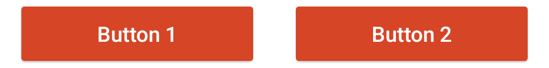
Example 1
This example uses a stack with horizontal orientation to place two buttons side-by-side. Horizontally-oriented stacks resize the width of their content so that everything fits. This can result in elements that are too small to use or see. If you would like the content inside of your stack to be scaled differently, use a multi-column table with an invisible grid instead.
You can copy this example into your document as-is.
<stack orientation="horizontal">
  <button content="Button 1" />
  <button content="Button 2" />
</stack>
Example 2
This is an example of a stack with auto orientation. This orientation switches between horizontal and vertical orientations depending on the size of the device. Auto is the recommended stack layout for plots and animations.
You can copy this example into your document as-is.
<stack orientation="auto">
  <button content="Button 1" />
  <button content="Button 2" />
</stack>

Buttons on phone in portrait mode

Buttons on phone in landscape mode
Styling Stacks
Since stacks allow you to group app elements together, they can be used to apply a style to multiple tags at a single time. For example, if you have a hidden solution that contains a paragraph and a few equations you can group them in a stack to easily change the visibility property on button press.